Final Project
Branding for a Retreat
Introduction Into the Brand
This is a retreat for the healing of body and mind, featuring alternative methods in areas of reiki, diet, meditation, spiritual connection and exercise. Murray and Mag’s first hand experience can give hope as well as step-by-step practical solutions to those who are willing to tap into their own inner healing without the need for expensive and at times unproven methods.
The aim of this project was to create branding materials that could be used at the retreat and that customers could buy and bring back to use at home.
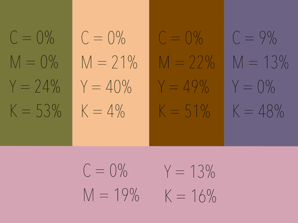
There are 7 colours associated with the traditional chakra and each of them reflects the frequency of vibrational quality of light of the energy centres. I chose to use these 5 colours for the brand.
Typography
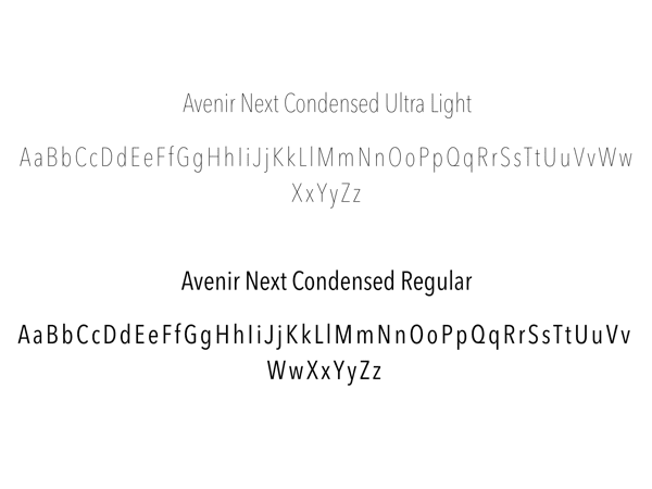
When choosing a font I was looking for a font that was light and easy to read. In my opinion Avenir Next Condensed was what I thought worked best, using regular for the headings and ultra light for the subheadings/text.
Logotype
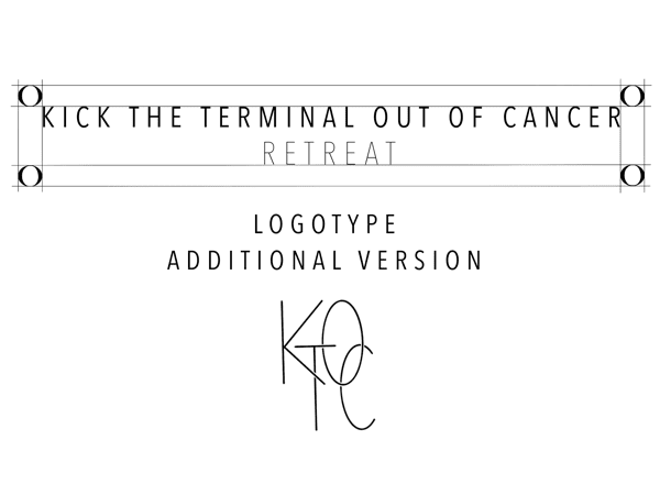
I created two logos that could be used for the brand. The longer logo will be the main logo used, the KTOC logo will be used to fit on smaller products.
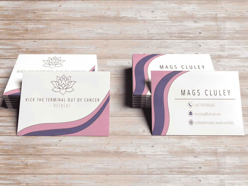
Business Cards
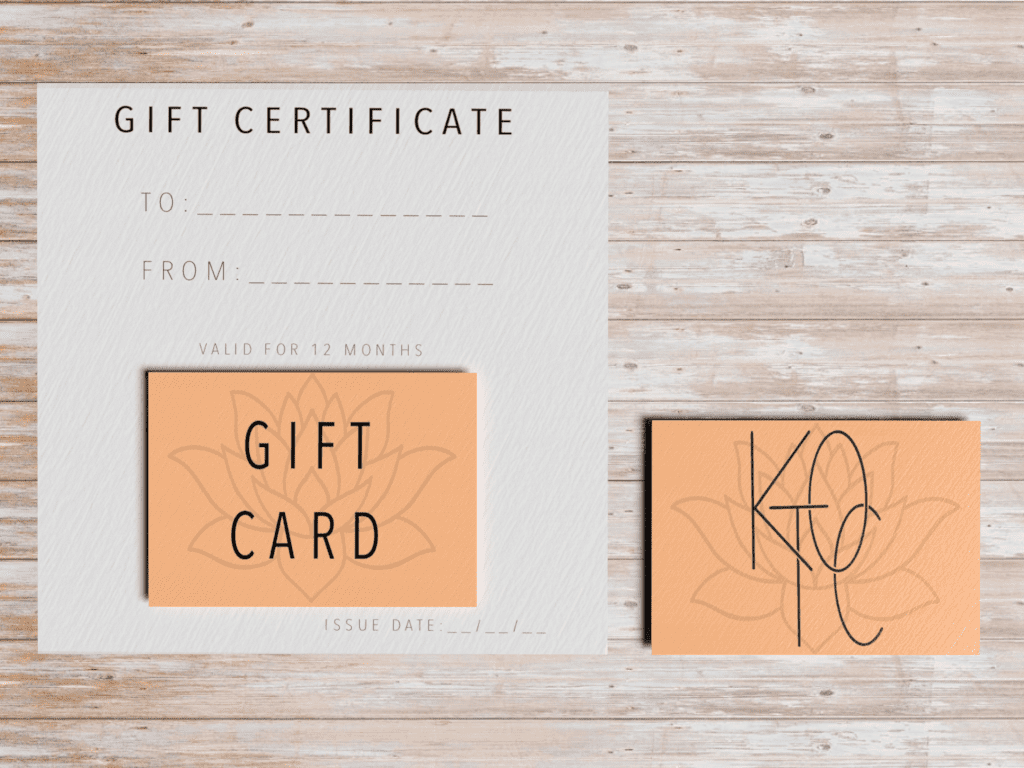
Gift Certificate
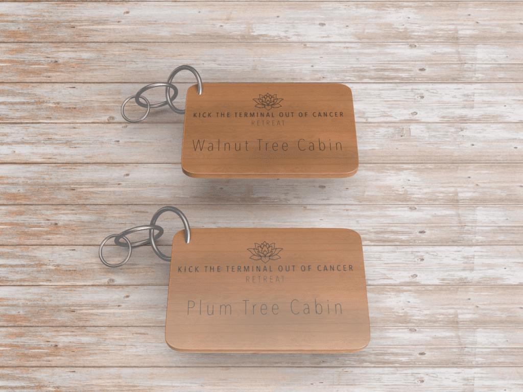
Keychains
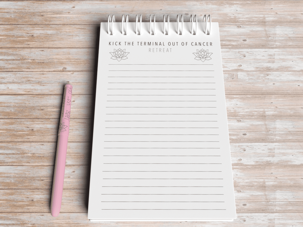
Notepad & Pen
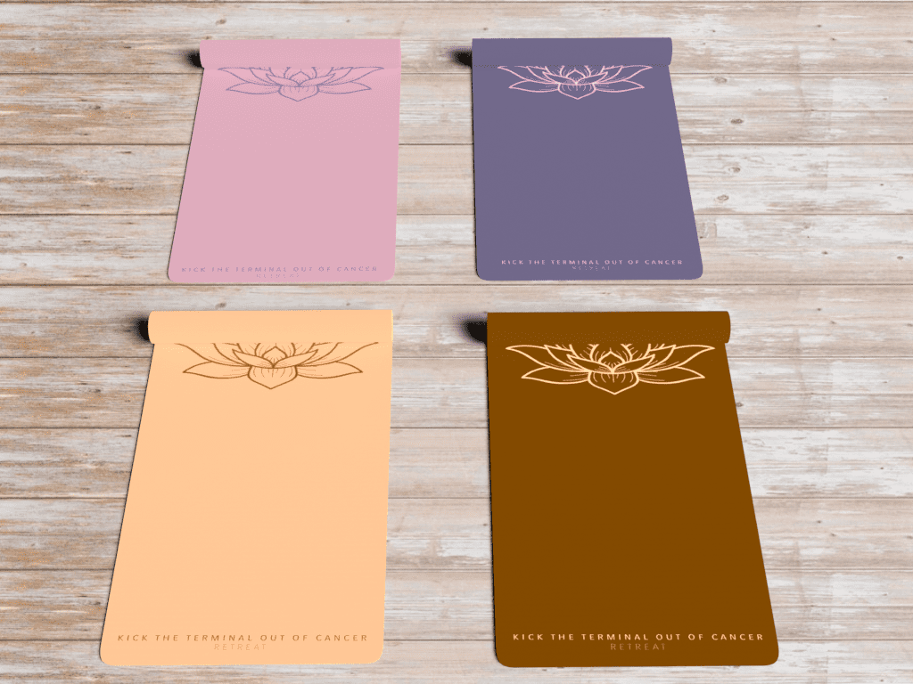
Yoga Mats
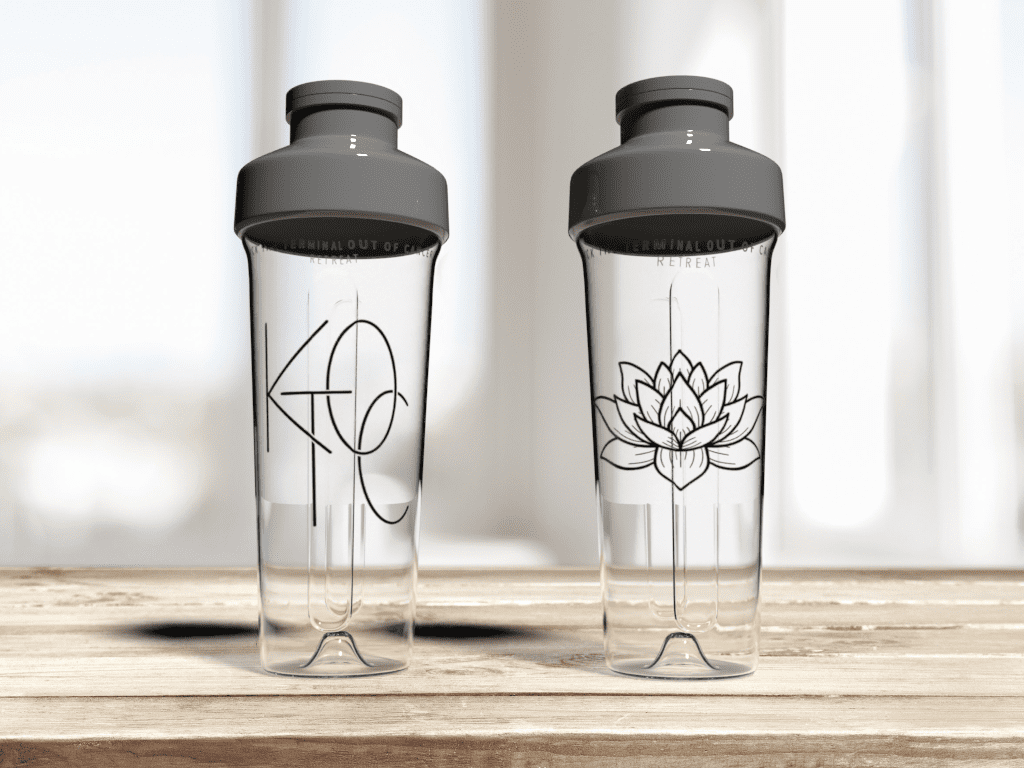
Pressed Juice / Water Bottle
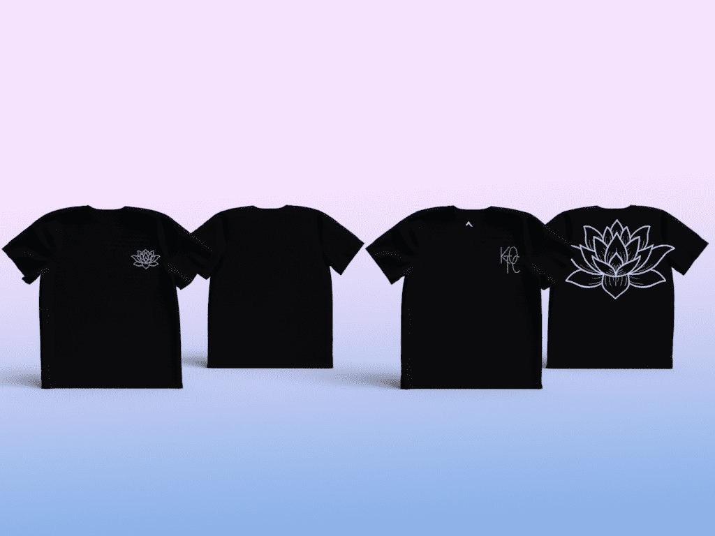
Black Cotton T-Shirt

Pink Cotton T-Shirt
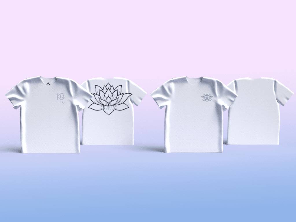
White Cotton T-Shirt
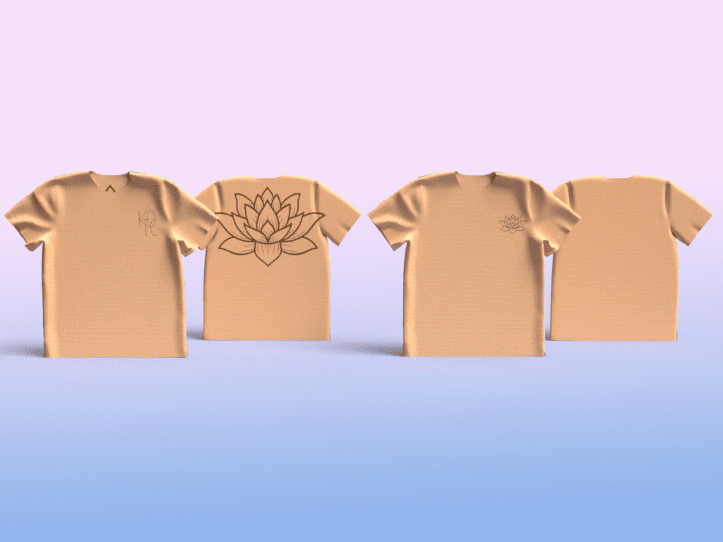
Beige Cotton T-Shirt
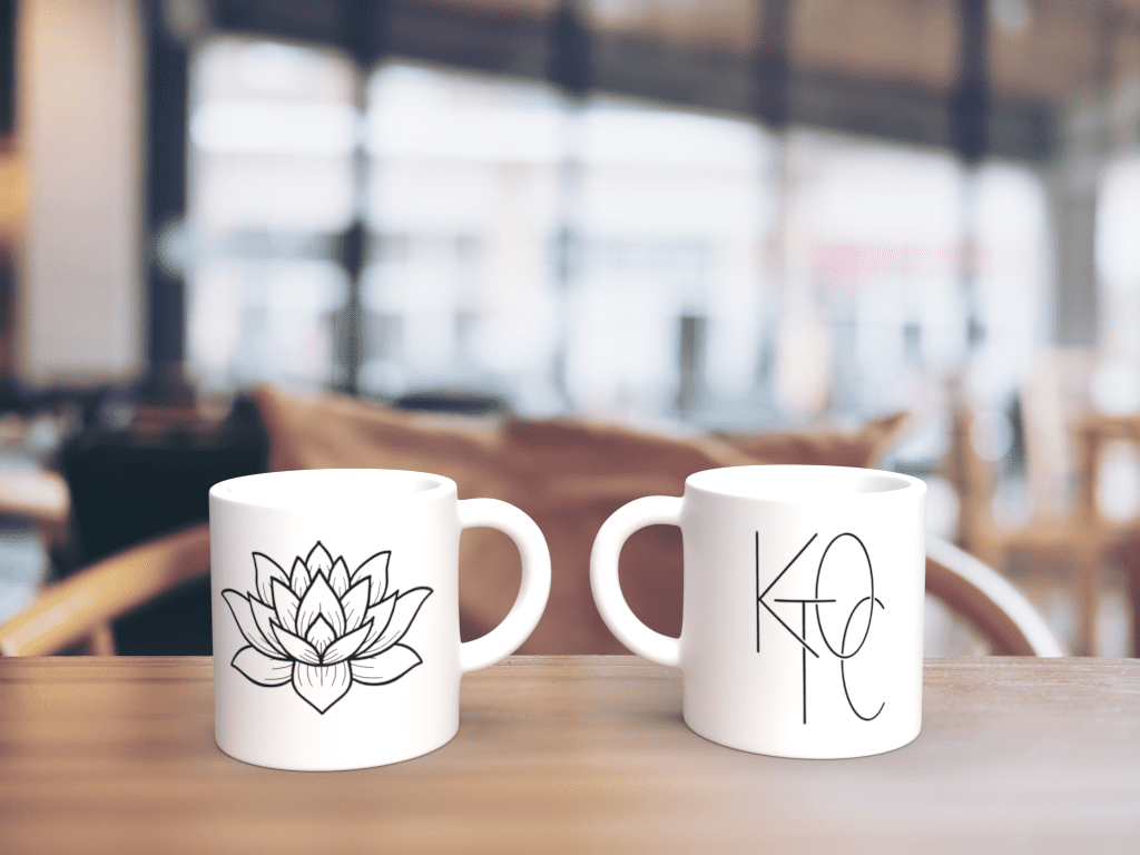
Mugs
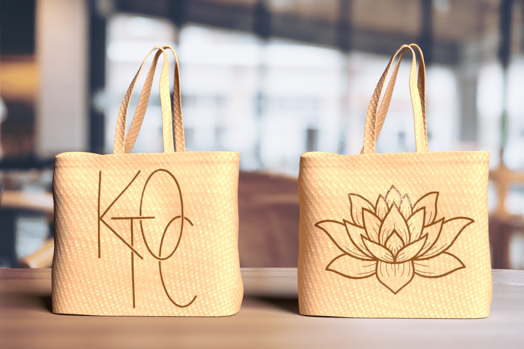
Tote Handbag
Other Work
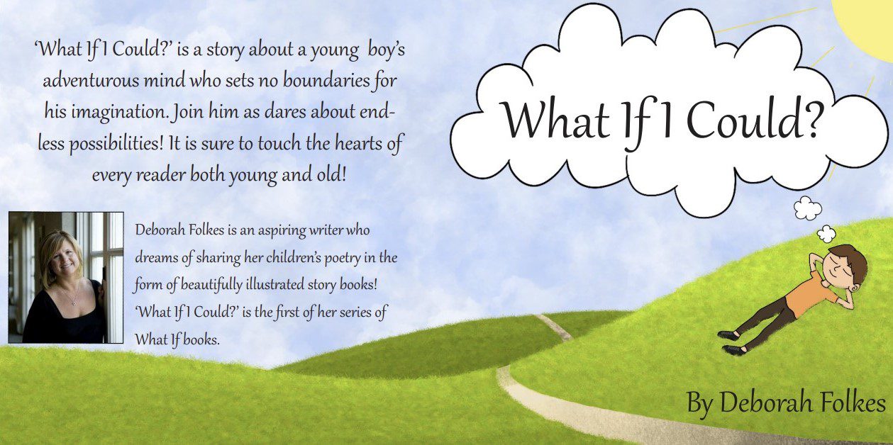
‘What If I Could?’ Children’s Book Cover
Visionary Thinkers
Visionary Creators
Visionary Makers
