
Dedicated designer with a growing passion to create innovative products and solutions. I believe designers have a responsibility to design for the future, shaping how individuals live their lives and how our cultures will advance and thrive.
Final Project
Vault.
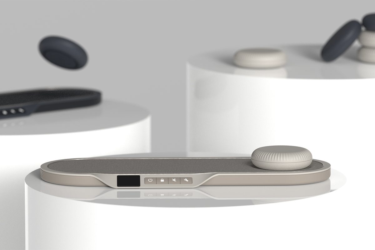
There is a push for a digital society. Leading banks are closing branches to make the change to only online services. Whilst, 3.5 million older people in the UK have never used the internet. Vault is a domesticated device, with the aim to enable elderly users to engage with online banking and regain financial independence. With limited functionality, it provides the user with enough choice to reinstate a feeling of power over their banking experiences whilst reducing the levels of confusion and error.
The Design Features.
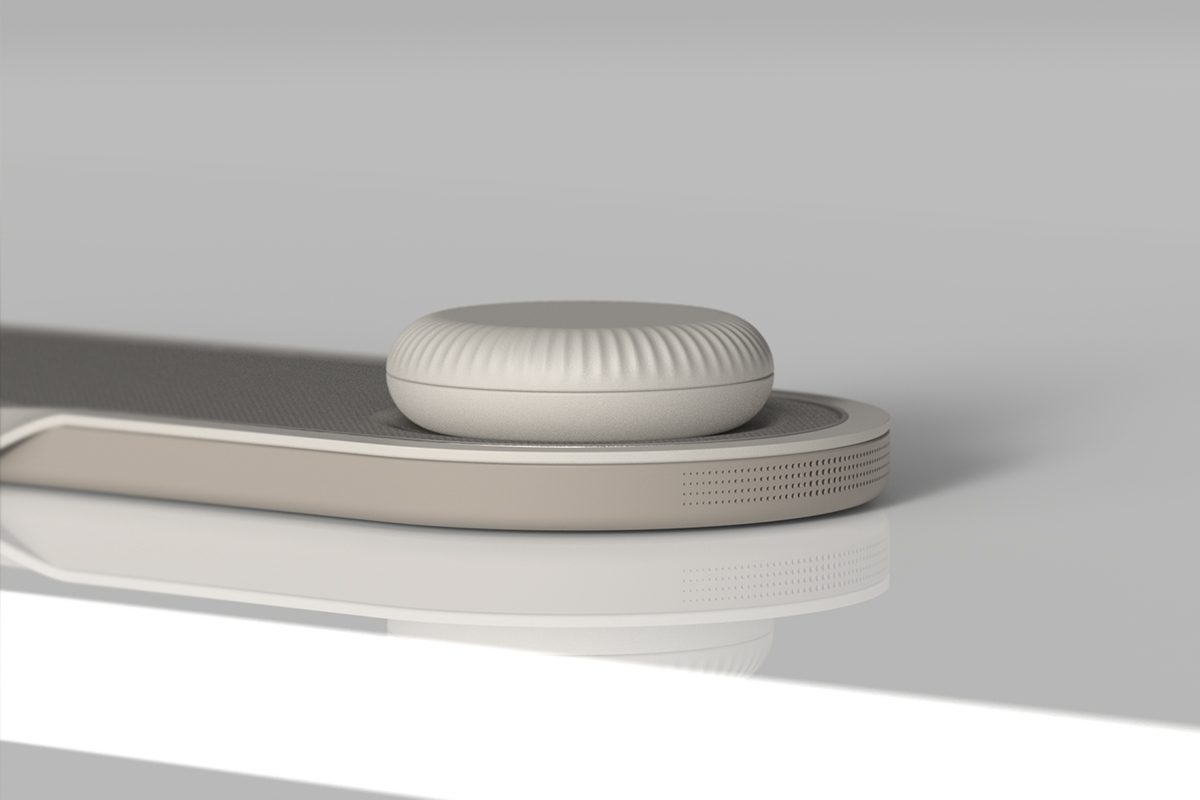
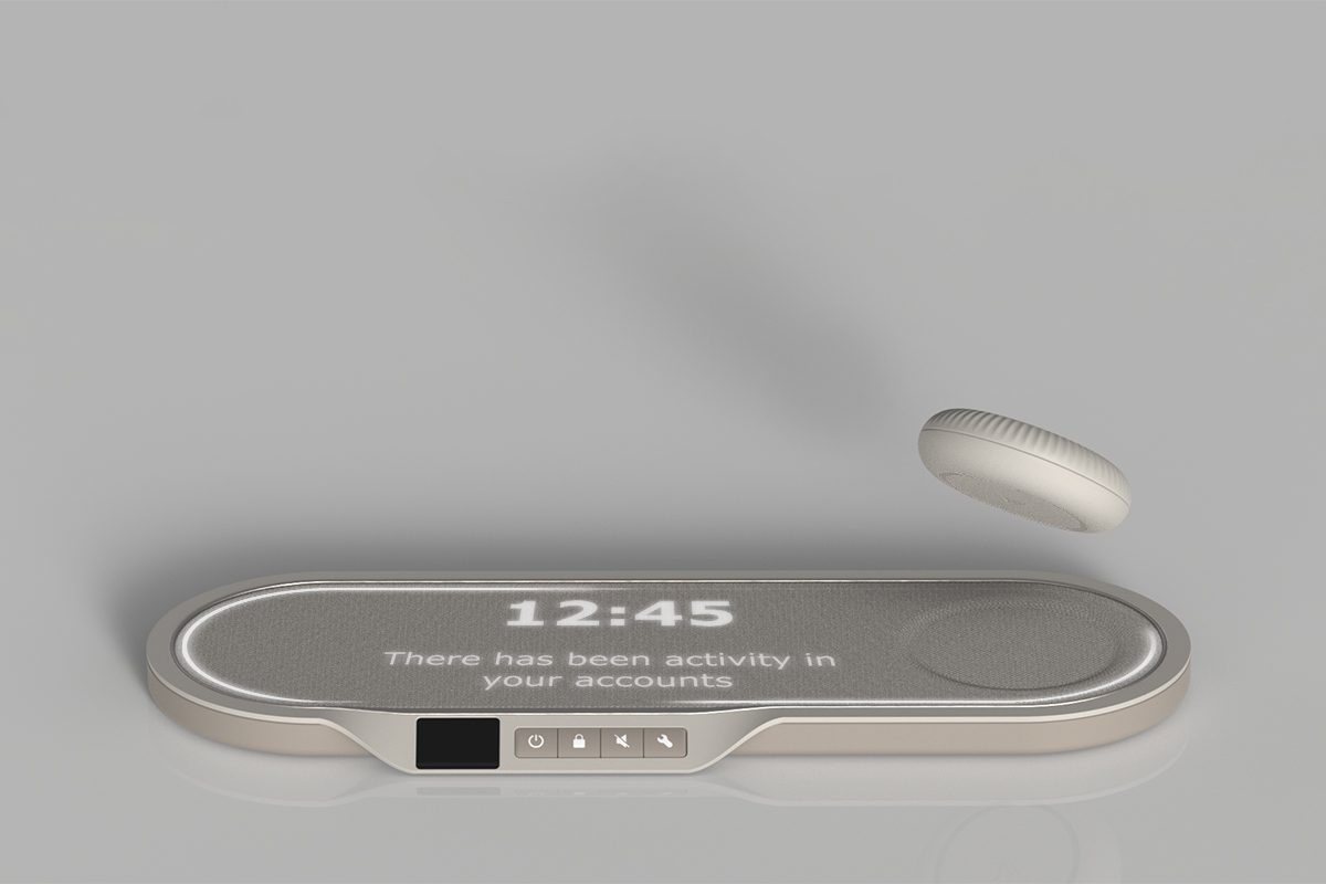
Vault features a wireless control dial, inspired by an old style radio, to navigate the display. The dial, is wireless to satisfy the differing reach and dexterity needs of the target user group. The display needed to be very easy to understand, interpret, and remember. So rather than having an information screen that showed both text and images, a display that made use of only LEDs and directional lighting was developed. Based on research, that showed light emitting materials were the best way of conveying messages without excessive use of words for both under and over-60s.
Using Non – Linguistic Metaphors.
A focus went into communicating through non linguistic metaphors within the design. It focuses on retrieving existing memories, otherwise known as schemas, through sensorial and known experience patterns. This gives the product a familiar feeling, creating a more intuitive and memorable interaction. For example, turning the dial to physically signify unlocking a “vault.” Further, swiping the dial across the pad, confirms a transaction in a more purposeful way. Inspired by and replicating sliding money to a bank clerk. Using haptic motors and speakers it mimics cash. Important to communicate the essential functions in a more understandable way.
Designed By The User, For The User.
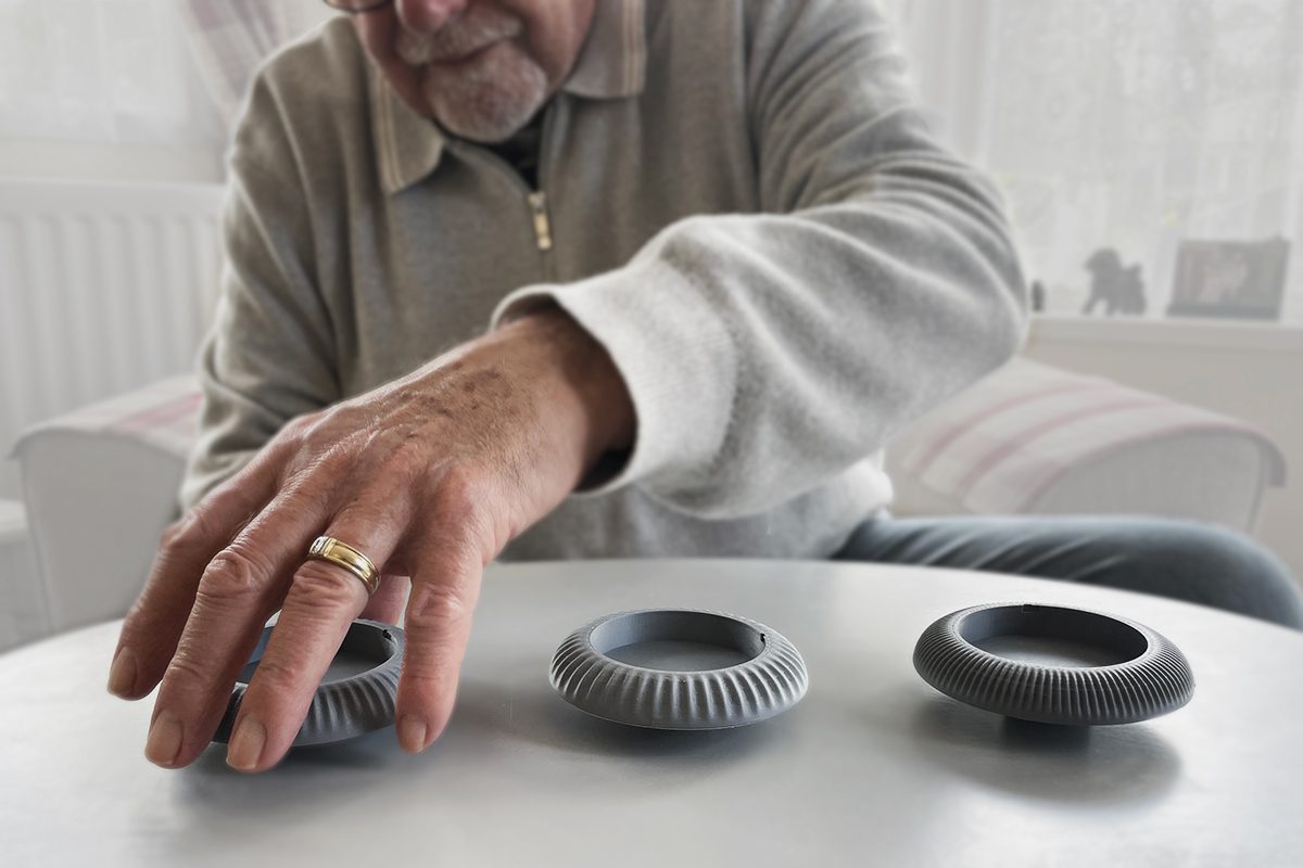
With inclusive design as a specialism, it was imperative that the user was transparently involved in the design process. Four main areas to develop by were identified, the thinking experience, the visual experience, the hearing experience and the dexterity experience. Through rigorous user testing based upon these, invaluable insights were drawn which ultimately led the design decisions made.
The Technology.
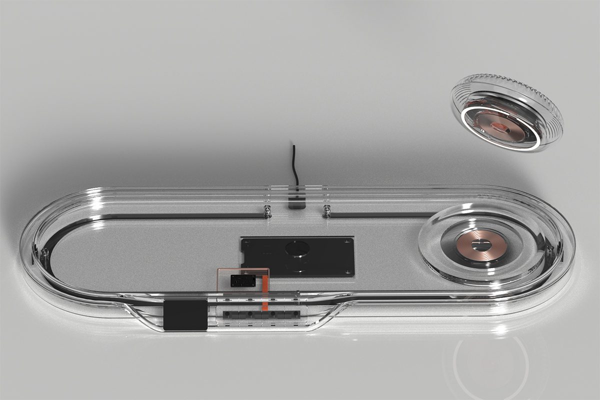
Vault works by using the open banking initiative and API technologies to deliver the financial data. The pad component, features a RFID contactless reader where the user will tap or place their card, and a finger scanner to complete two factor authentication. The dial is wirelessly charged through the pad when placed in location, discreetly identified by the indentation. Haptic feedback motors inside the dial are responsible for the soft coin like jingle. A 360 rotary encoder push button, attached to a 2Rs enclosed bearing inside the dial creates the smooth turning motion.
The Finer Details.
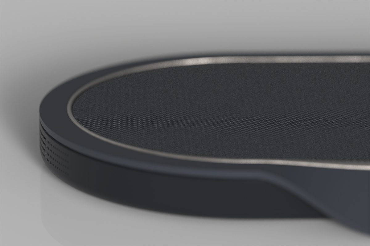
ABS finished with a soft touch, matte coating compliments the woven, recycled PET fabric.
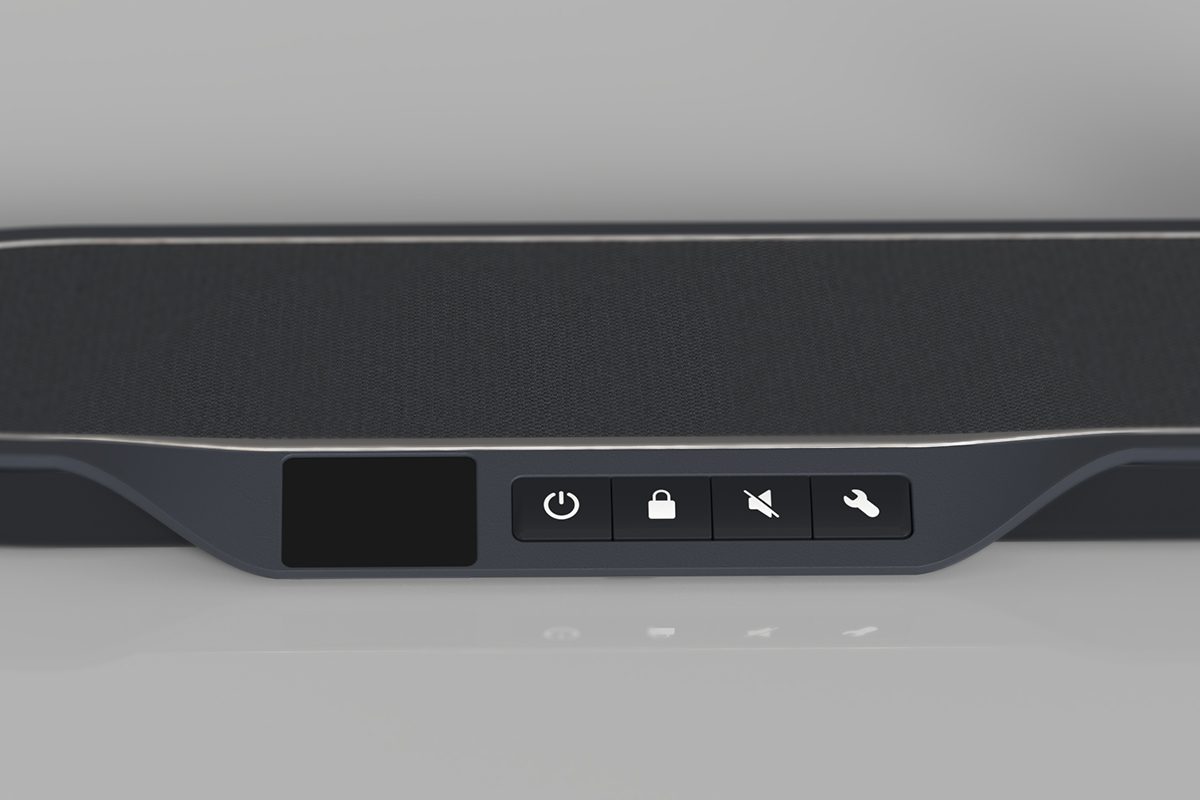
An angled surface allows for larger buttons and finger scanning interaction point.
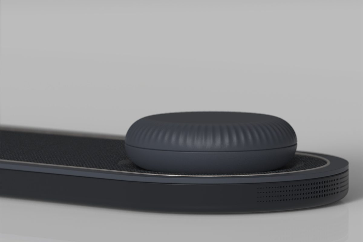
Ribbed detailing provides the user with satisfactory grip to turn the dial, despite any dexterity issues.
Scenario Of Use.
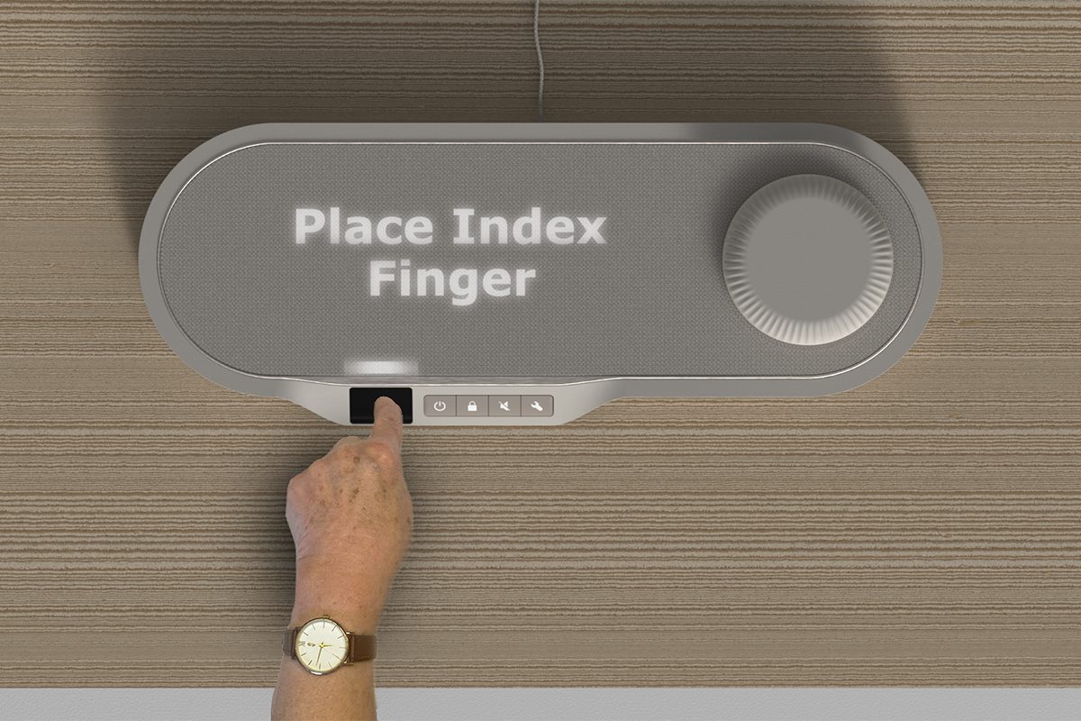
To unlock Vault, identity must be confirmed. Achieved through 2 factor authentication, the user must tap the associated card to the pad, indicated by the LED display. A finger print scan is also then required. Once unlocked, the user turns the top of the dial to mimic the motions of opening a safe, to load a home screen where functions are presented. Along the front are 4 large buttons, to turn on/off and lock vault, stop the audio prompts and a shortcut to settings.
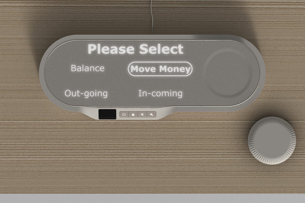
Using the dial, the user can flick through 4 functions. They can learn their current balance, view their recent outgoings, view their recent incomings, and make transactions to a list of pre defined payees. They press the dial inward to make a selection, and continue to turn it for further control. The only “functional” option is the transaction. The others are purely just to view data rather than make any edits to accounts.
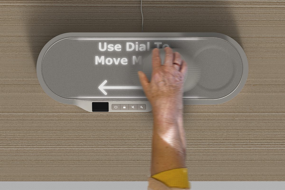
Once preferences have been made regarding the payee and amount, Vault uses multiple confirmation factors. Before the user is prompted to slide the dial, they are asked to confirm the details. If correct, the user completes the physical motion and is then asked to confirm the details of the transaction just “completed”. The actual transaction doesn’t actually happen until they confirm a second time, meaning if a mistake is noticed “after” it can still be cancelled or corrected.
Awards.
- 2022 Diploma In Professional Studies. Completed a year in industry, with an investigative report on “The relationship between product design, corporate visual identity and brand identity, and their importance as tools to boost a business’ success.”
- 2023 Design School Nominee. Shortlisted for the RSA student awards.
Work Experience.
2021/22 – PriestmanGoode. I gained invaluable experience within this strategic and innovative multidisciplinary design company. I was involved in a range of both private and commercial projects. The most notable was working with one of their longest standing clients – United Airlines. Whilst working with this client I was involved in everything from brand identity to cabin interiors, lounge design, way finding, onboard products and services. I was given the independence and trust to complete design work and eventually present these back to the VP of marketing myself. This opportunity allowed me to witness the breadth and depth it takes to design for industry, whilst developing a wide range of applicable skills.
2018 – WDS mobile limited. Specialised in UX design. Liaising with senior directors to meet real working deadlines. During my time I gained a lot of knowledge into digital user experience, learning how the end consumer was at the root of every business level decision. Forming the foundations of my UX design knowledge.
Visionary Thinkers
Visionary Creators
Visionary Makers