
Helina is a digital-based designer who loves to push the boundaries of what visual communication can achieve. Specialising in typography, editorial, and experiential branding, her eye for innovative and contemporary design solutions are what drives her work.
Final Project
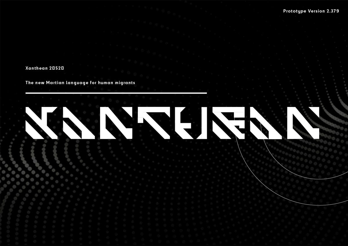
Xanthean
Xanthean is the new and exclusive language that will be spoken by the first colony, set to land on Mars in 2050.
Origins
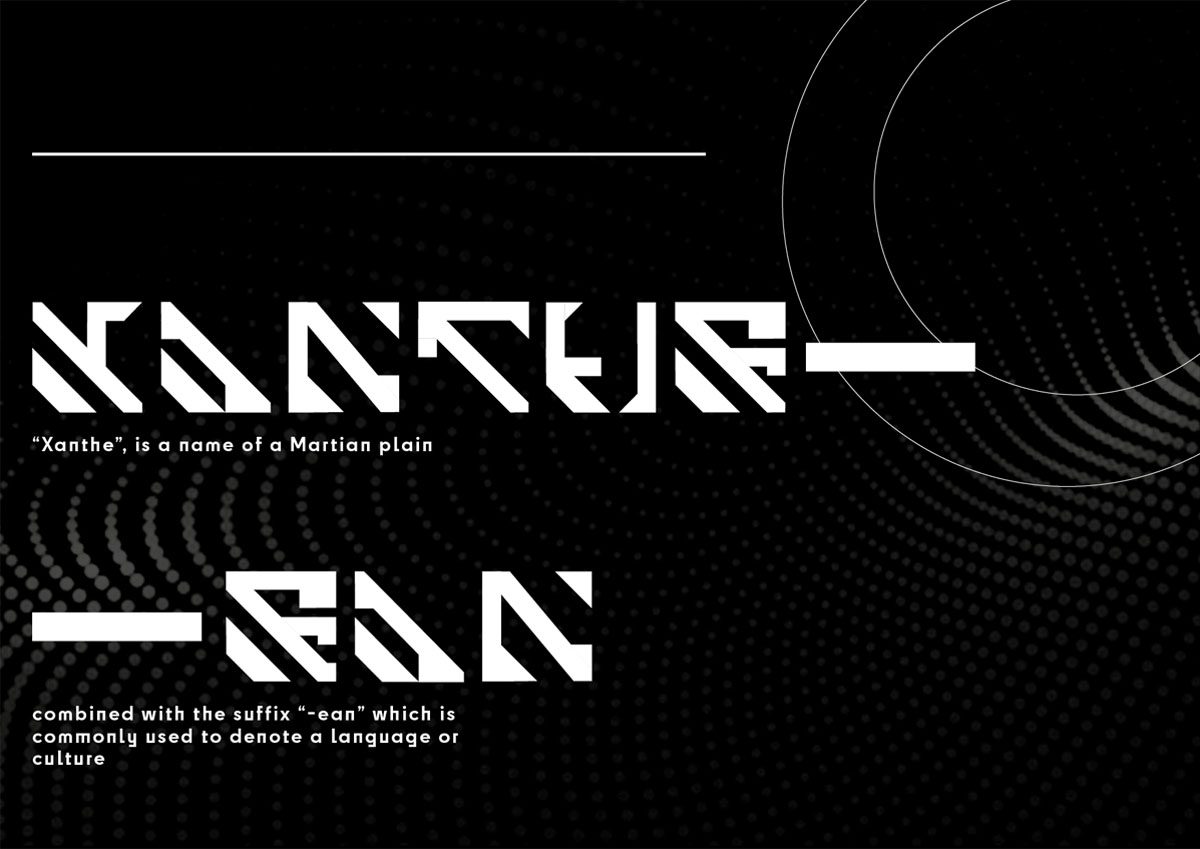
Derived from the name of the Martian plain ‘Xanthe Terra’, the name of this typeface combines ‘Xanthe’ with ‘-ean’; a suffix that is used in languages that originated from Latin, denoting language and culture.
Typeface Set
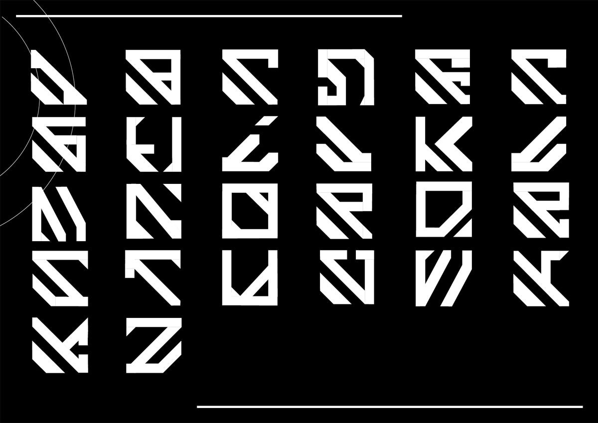
Using the familiar asset of the English alphabet, this typeface was designed in an abstract and futuristic style to resemble a never-seen-before language.
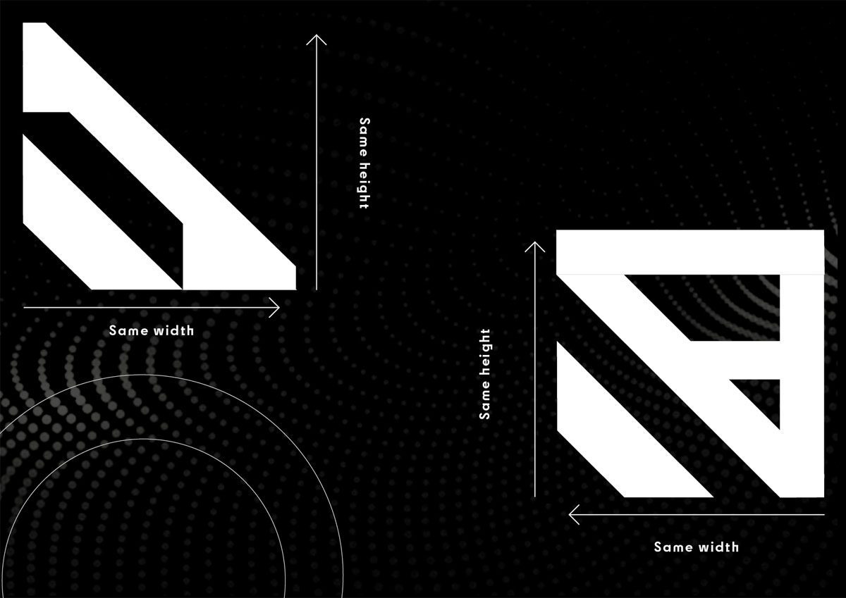
Individual Characters
Each character is equal in size and uses a range of line weights to add dimension and form to the typeface. Serifs are also added to characters for decorative effect so the typeface creates the facade of being a new language.
In Motion
For the new colony migrating to Mars in 2050, technology and the use of screen displays will be the most dominant method of communication. So, placing the typeface in motion displays how it can be translated to screen.
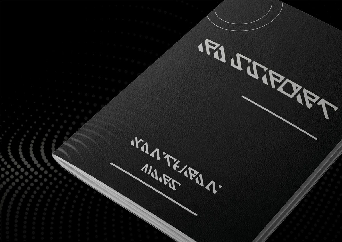
Passport
To place Xanthean into context, the first touchpoint that users would experience would be through receiving personal passports for the new colony.

Boarding Ticket
Boarding tickets would be the following touchpoint for migrants to travel to their new home and to gain first-hand experience on how the language would be used and operate for services.
Penguin D&AD
Asked within this brief, was to design a line of merchandise products that appeals to Generation Z and enhances their reading experience. Focusing on features that are important to Gen Z like sustainability and vintage aesthetics that they can identify and relate with to the brand of Penguin.
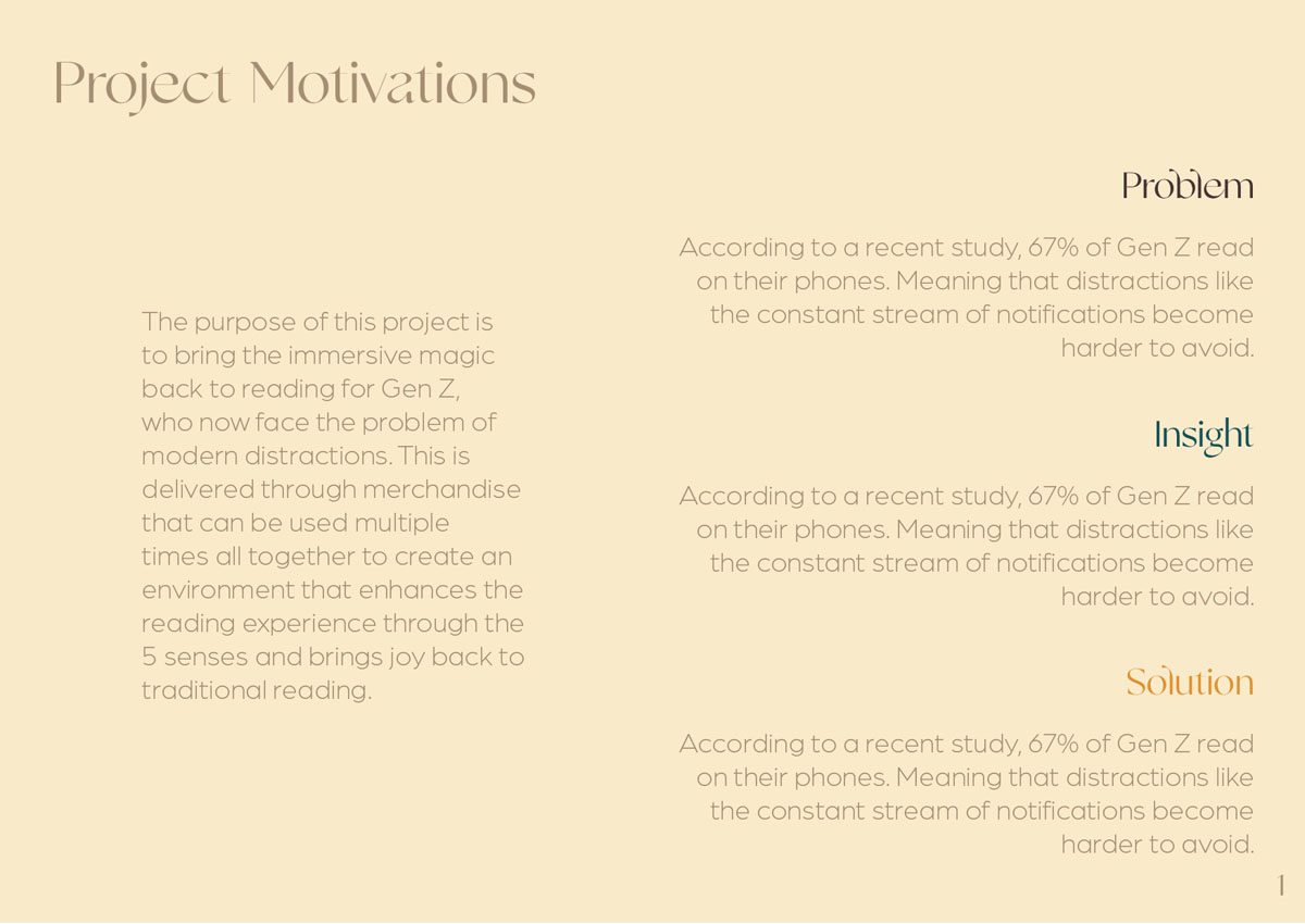
The interpretation of the brief involves bringing the immersive magic back to reading for Gen Z, who now face the problem of modern distractions. So, the 3 merchandise products can be used multiple times and combined to create an environment that enhances the reading experience through the 5 senses. Bringing joy back to traditional reading.
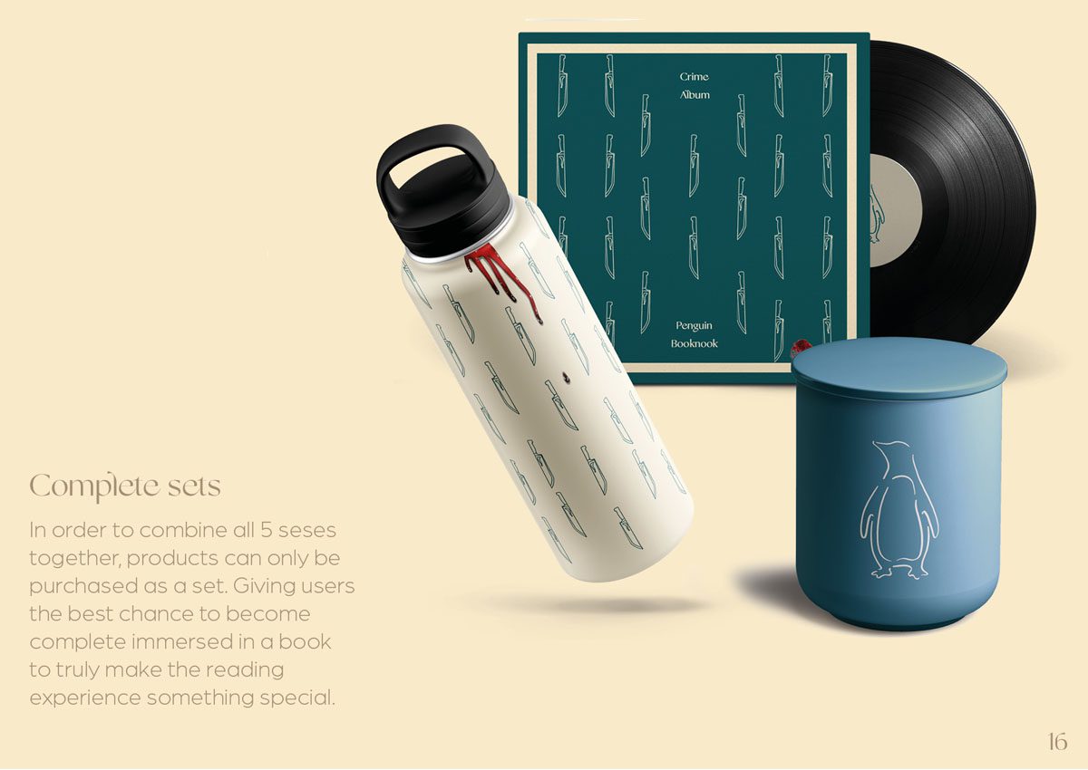
The complete sets of merchandise products will be sold together in 3 different lines of decoration; romance, crime, and fantasy. Readers can then select what line of merch they would like to buy based of their favourite genre, or on what they are currently reading.
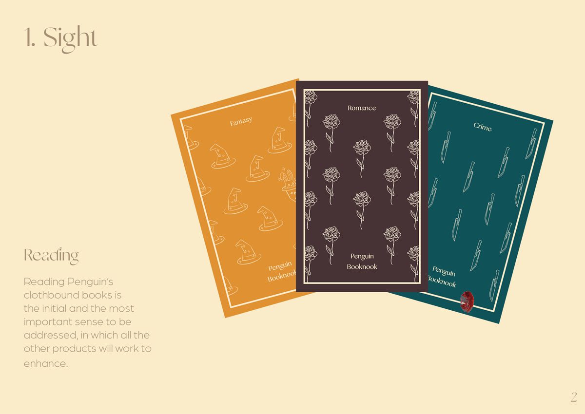
1. Sight
The first sense that would be involved within the merchandise line would be sight, from reading Penguin classics that include the best novels in crime, romance, and fantasy.
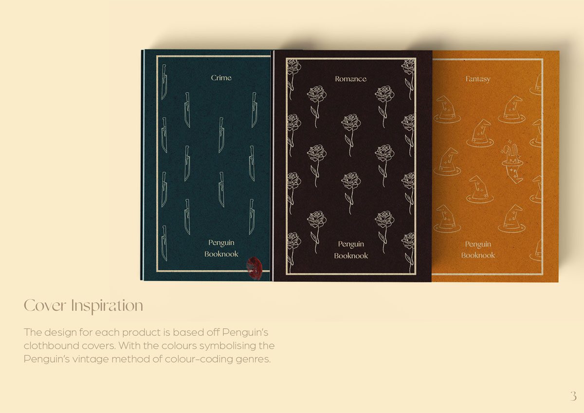
However, especially for the product lines, limited edition classic clothbound book covers have been designed to represent the genre in which the customers chooses.
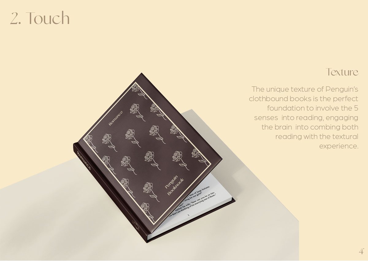
2. Touch
Touch would involve holding the clothbound Penguin classics that this project and merchandise line is based off.
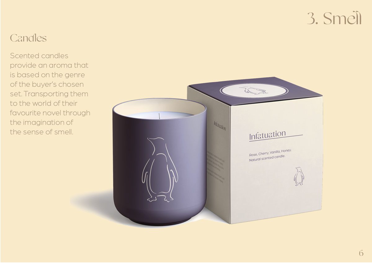
3. Smell
The third sense of smell would be incorporated through scented candles that use fragrances based of the tropes of either romance, crime, or fantasy.
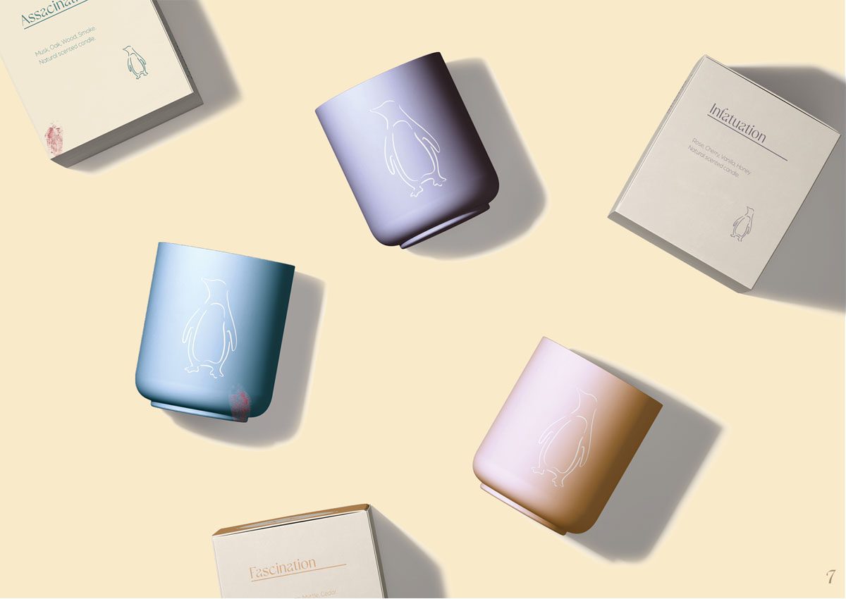
Each of the candles and genre are featured in the colour that was used to portray the genre when Penguin categorised their novels by colour. This embodies the nostalgia and vintage style of the brand, that can now be recognised and used by a Gen Z audience.
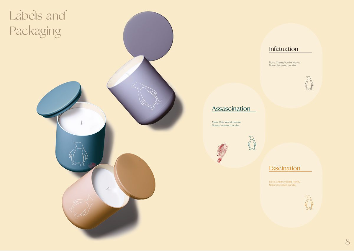
An example of the fragrance range is for romance, notes of rose, cherry, vanilla, and honey are blended together to make a sweet scent that readers can recognize and affiliate with the joy of reading and escaping into romance novels.
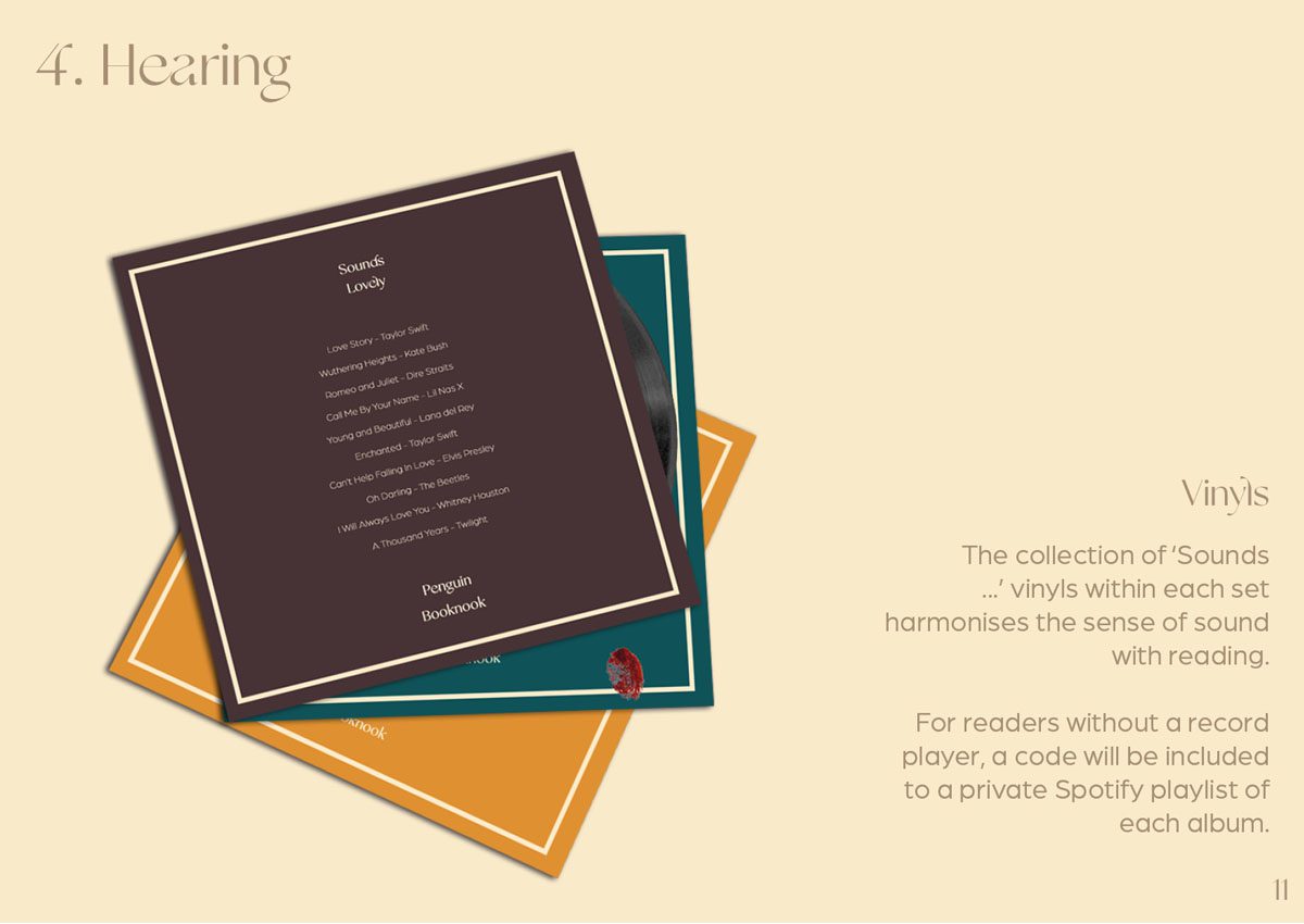
4. Sound
Sound will be incorporated to the merchandise sets through branded and decorative vinyls that include playlists of songs that are either based of the general genre of choice, or songs that are inspired by famous novels within either romance, crime, or fantasy.
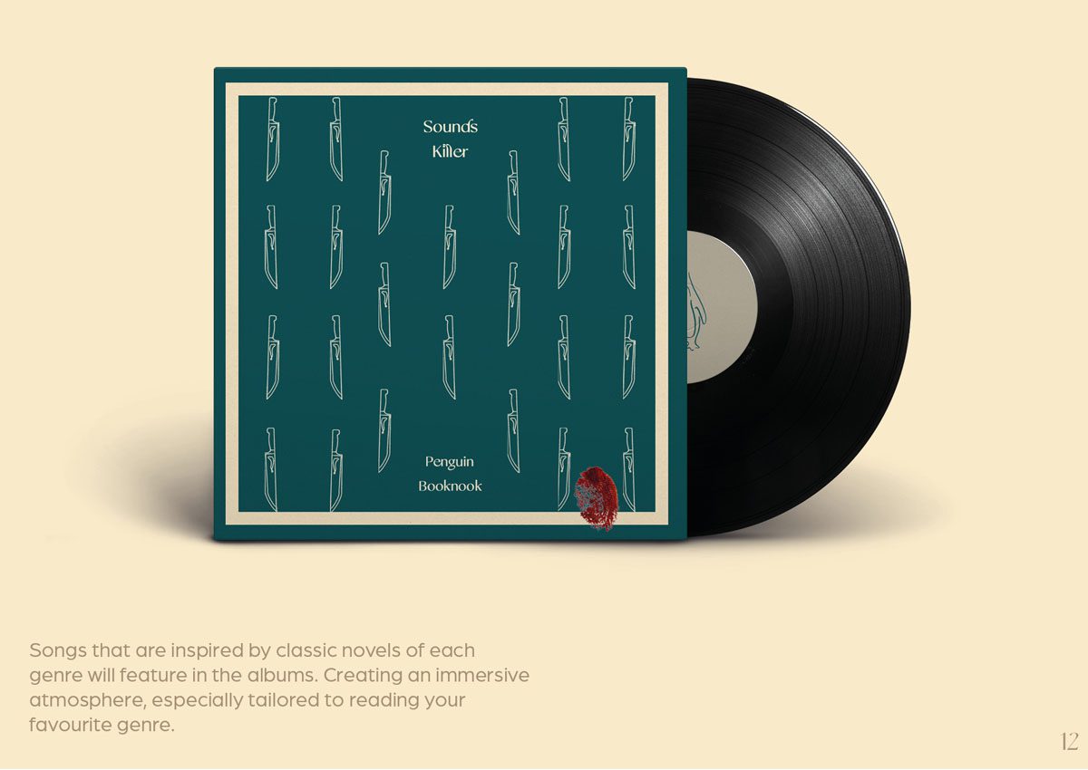
The vinyl covers are based of the famous clothbound book covers that are also used within this merchandise line. With icons based of the stereotypical imagery of each genre.
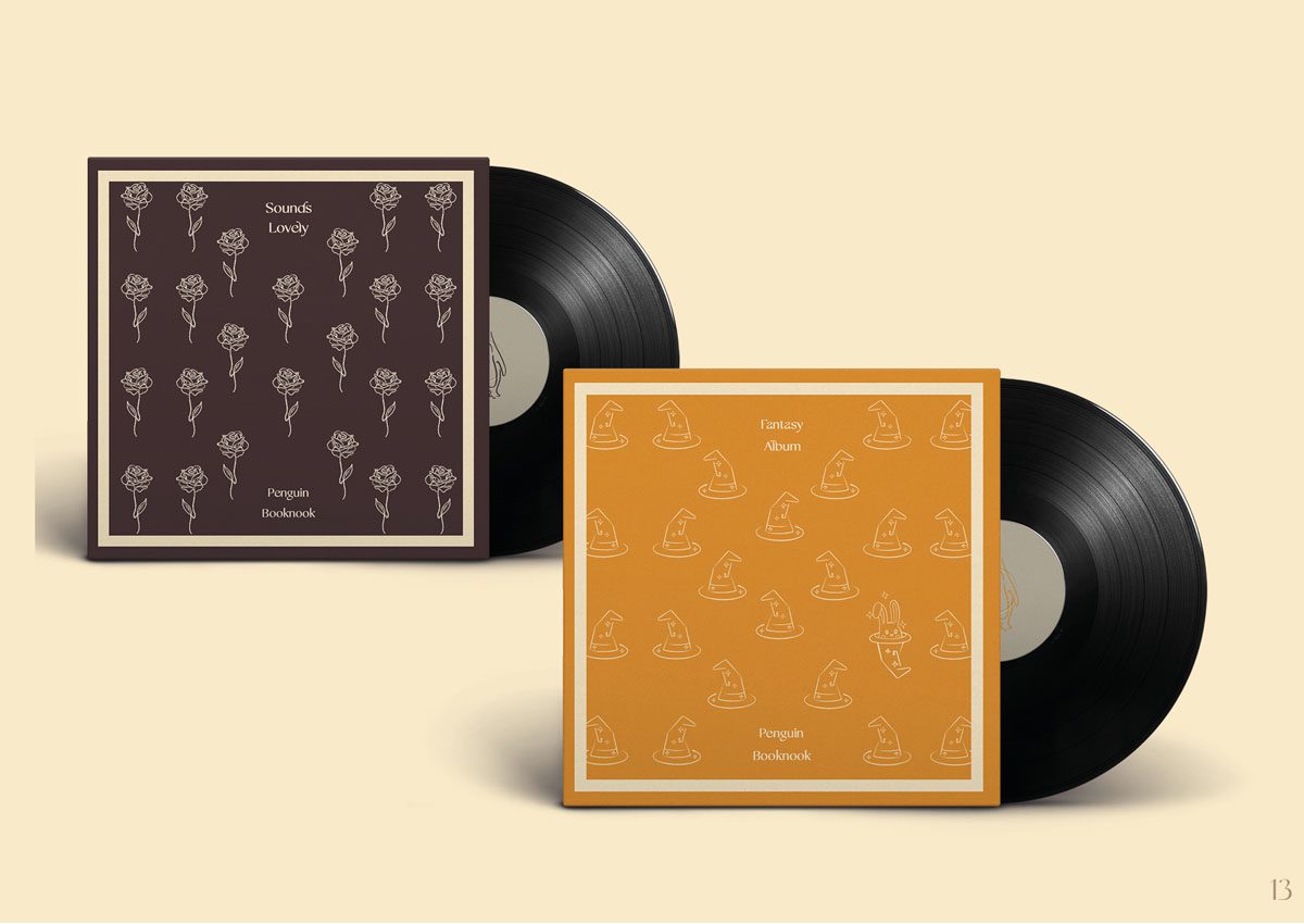
Hidden in the crime and fantasy vinyl cover designs are small details that convey more personality and character to the products in order to represent the traits of the genres. Breaking them away from the classy and sophisticated design of the romance products and getting the audience more immersed in the products as well as reading.
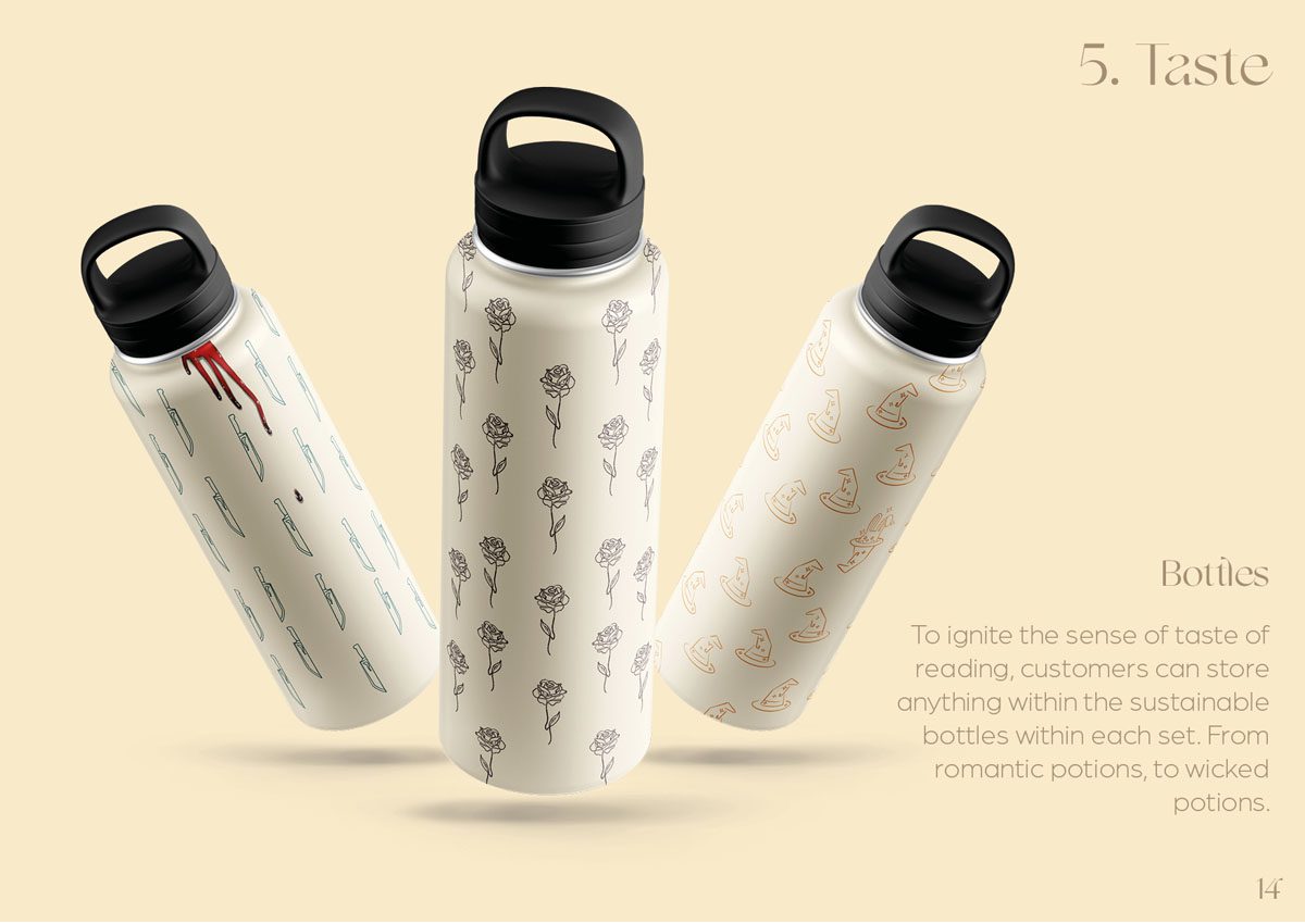
5. Taste
Taste is represented through reusable bottles that could be used for romantic cocktails, to fantastic concoctions. The fact that these bottles are reusable also meets the Gen Z’s values for sustainable products and brands.
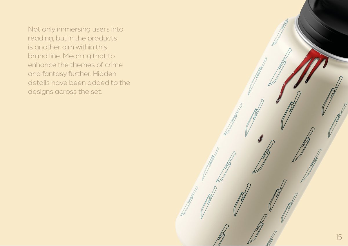
Similar to the other products, the bottle designs also feature hidden details and are created to be used whilst reading in tandem with the rest of the products, curating a full and immersive experience needed for a comfortable reading period.
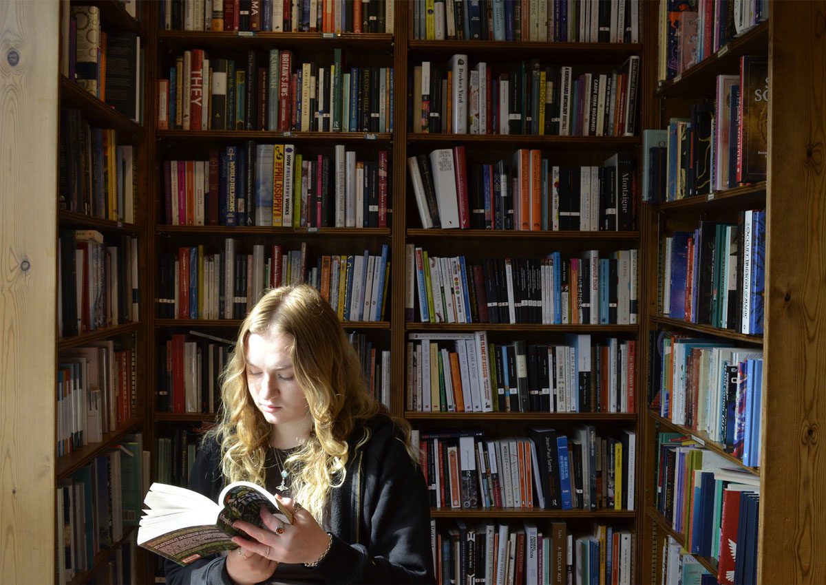
Photography
To both place the merchandise line into context and tie the pitch for the project together,
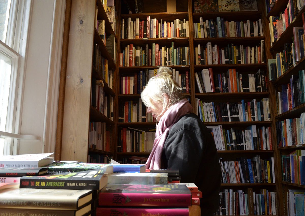
photography is used to portray the audience and how the products can be used together
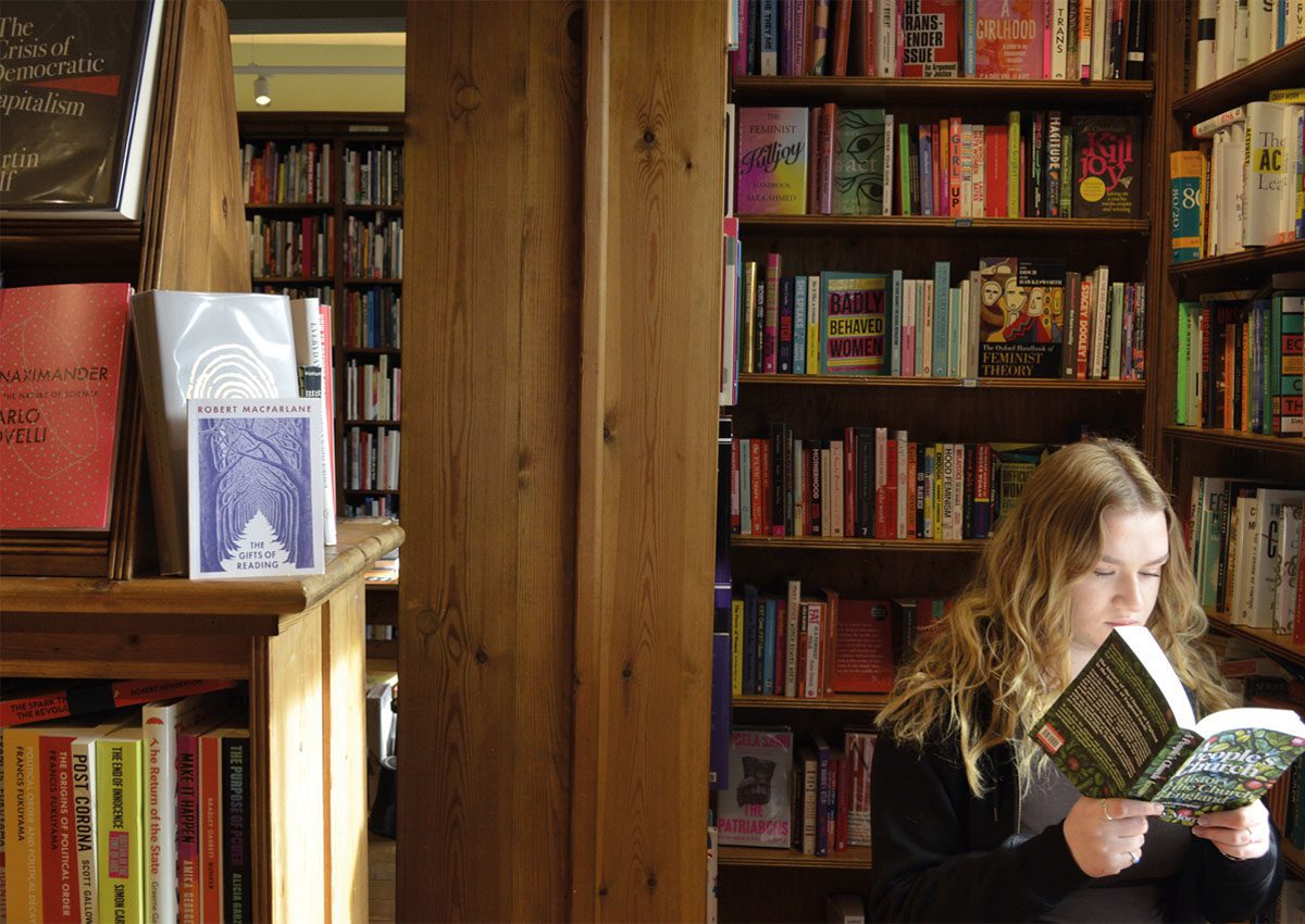
in a setting that would attract and yet feel familiar to a target audience of Gen Z who love to read.
Visionary Thinkers
Visionary Creators
Visionary Makers