Final Project
SOVA
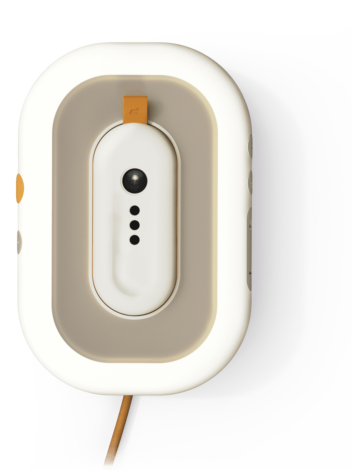
Sova is a sleep aid device designed to support the development of a toddler’s (0-5) sleep cycle and encourages healthier sleeping practices. Together with an application, the caregivers obtain essential sleep knowledge and can gain confidence about their child’s sleep.
Light and Sound
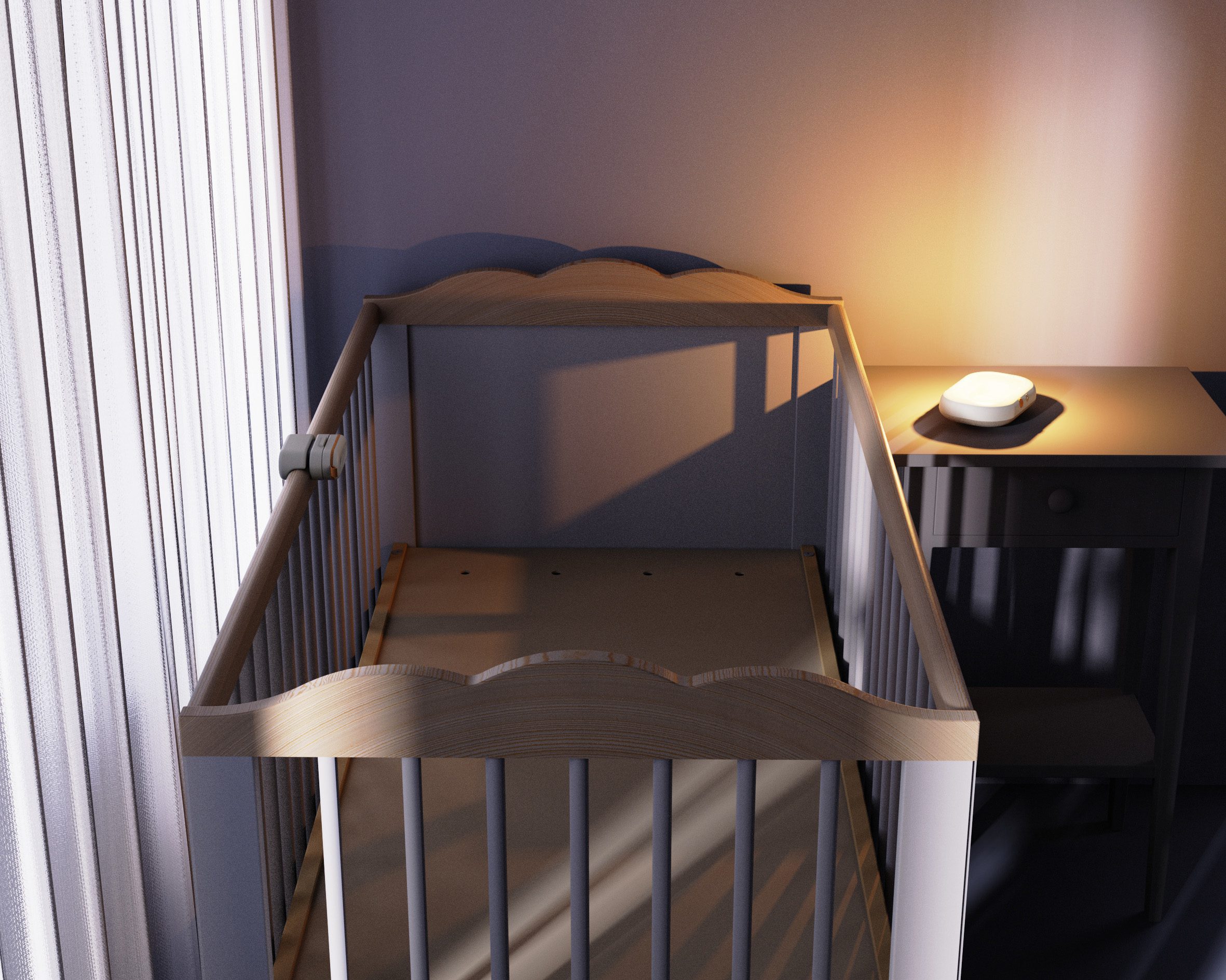
To assist the caregiver in getting the toddler to sleep, there are light and sound features that can be customised on the app. These features act as visual and auditory cues for the child to understand their sleeping routine. AI will also aid the user during the light and sound selection within the app.
Routine Development
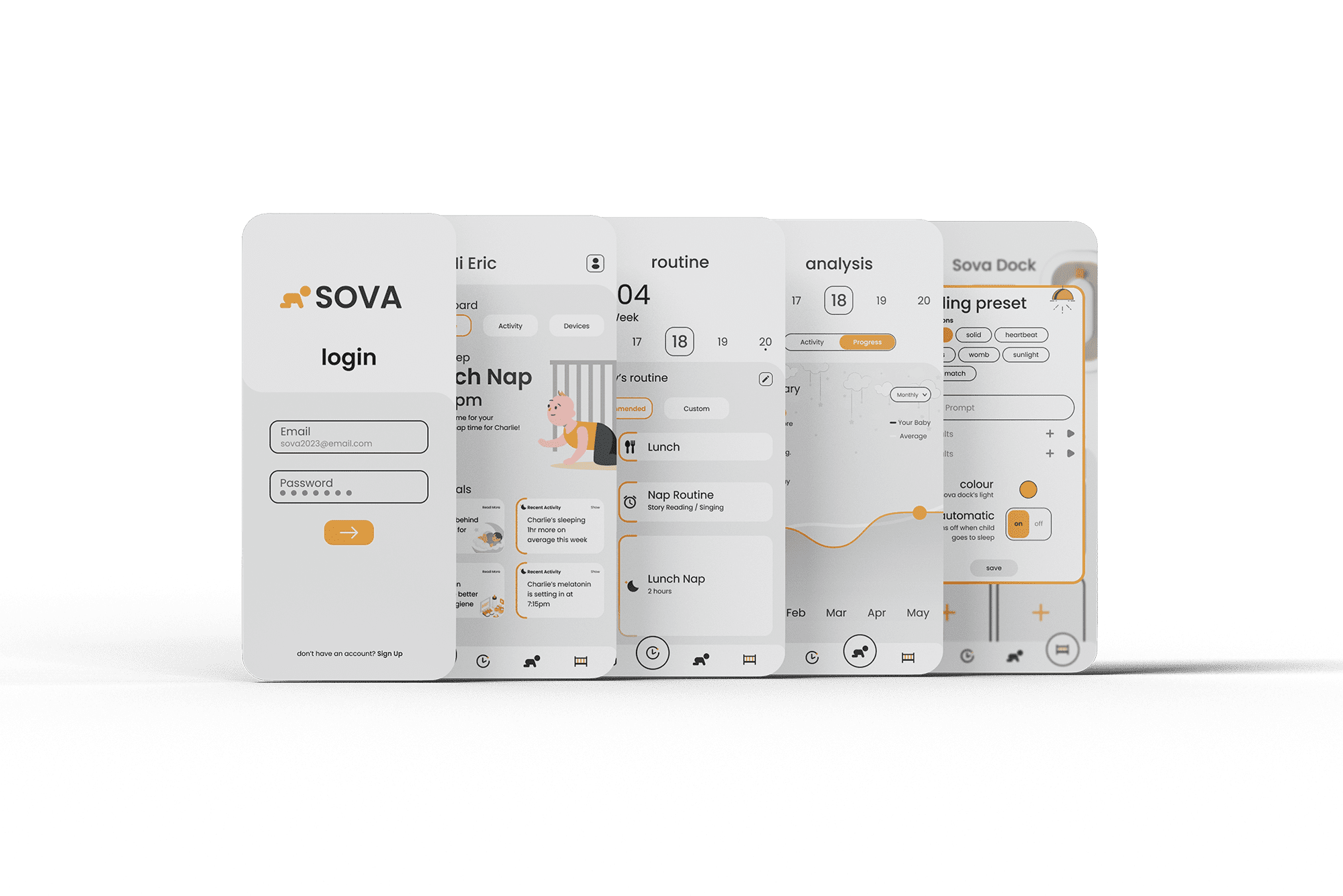
In order to develop healthy sleeping habits for toddlers, caregivers need to set consistent routines for the child. Through several stakeholder interviews, I was able to incorporate a recommended routine which would show up within the application. This routine would be fully customisable and over time, the system will learn about the user and mould around the toddler’s preferences.
UX Specialism
Sova requires a lot of physical interaction with the device as well as interaction with the app. By going through the UX design process, I was able to develop interactions appropriately as well as a user-tested application. The application follows the design of the device with its playful and light-hearted design language.
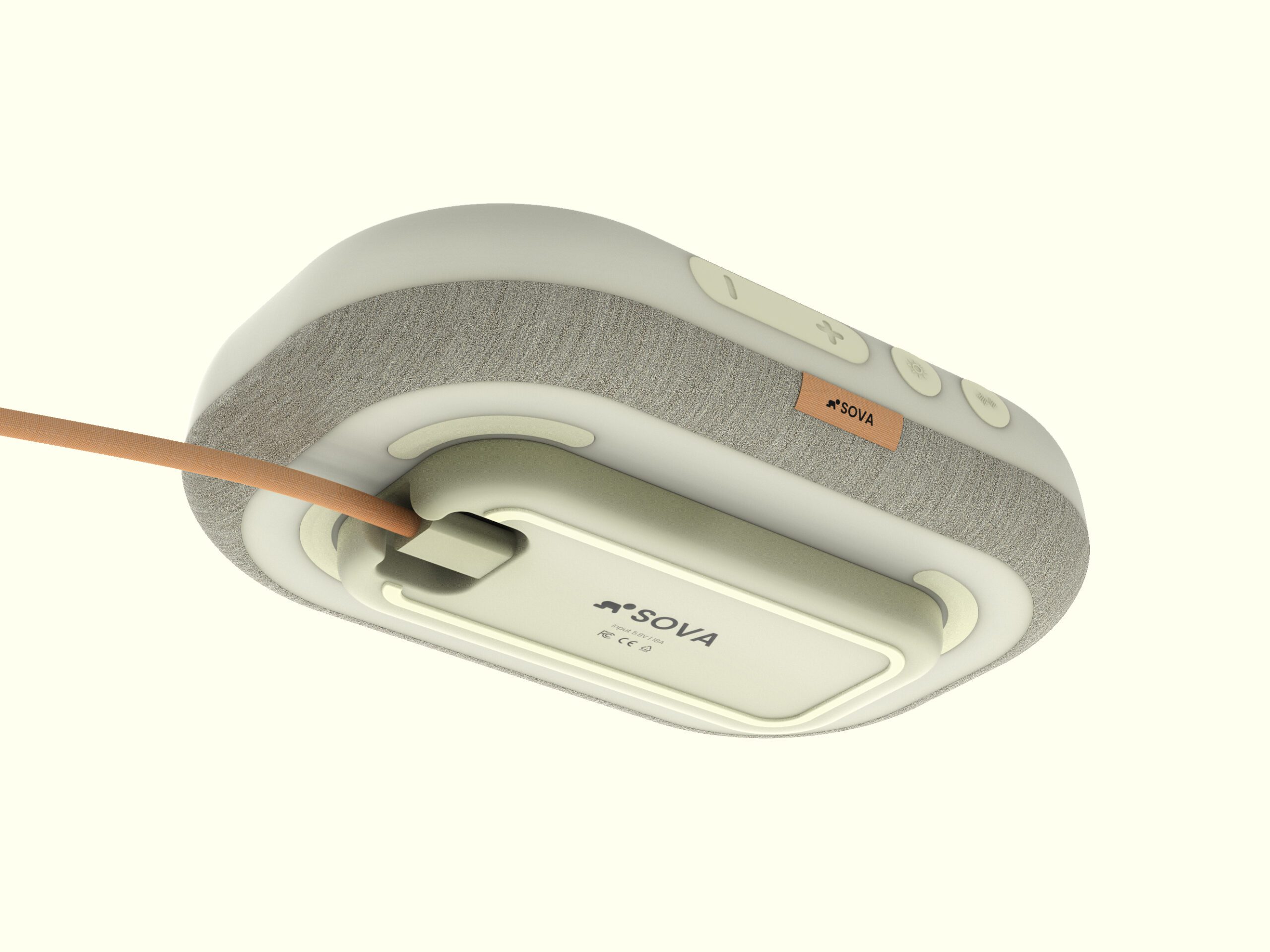
CMF Selection
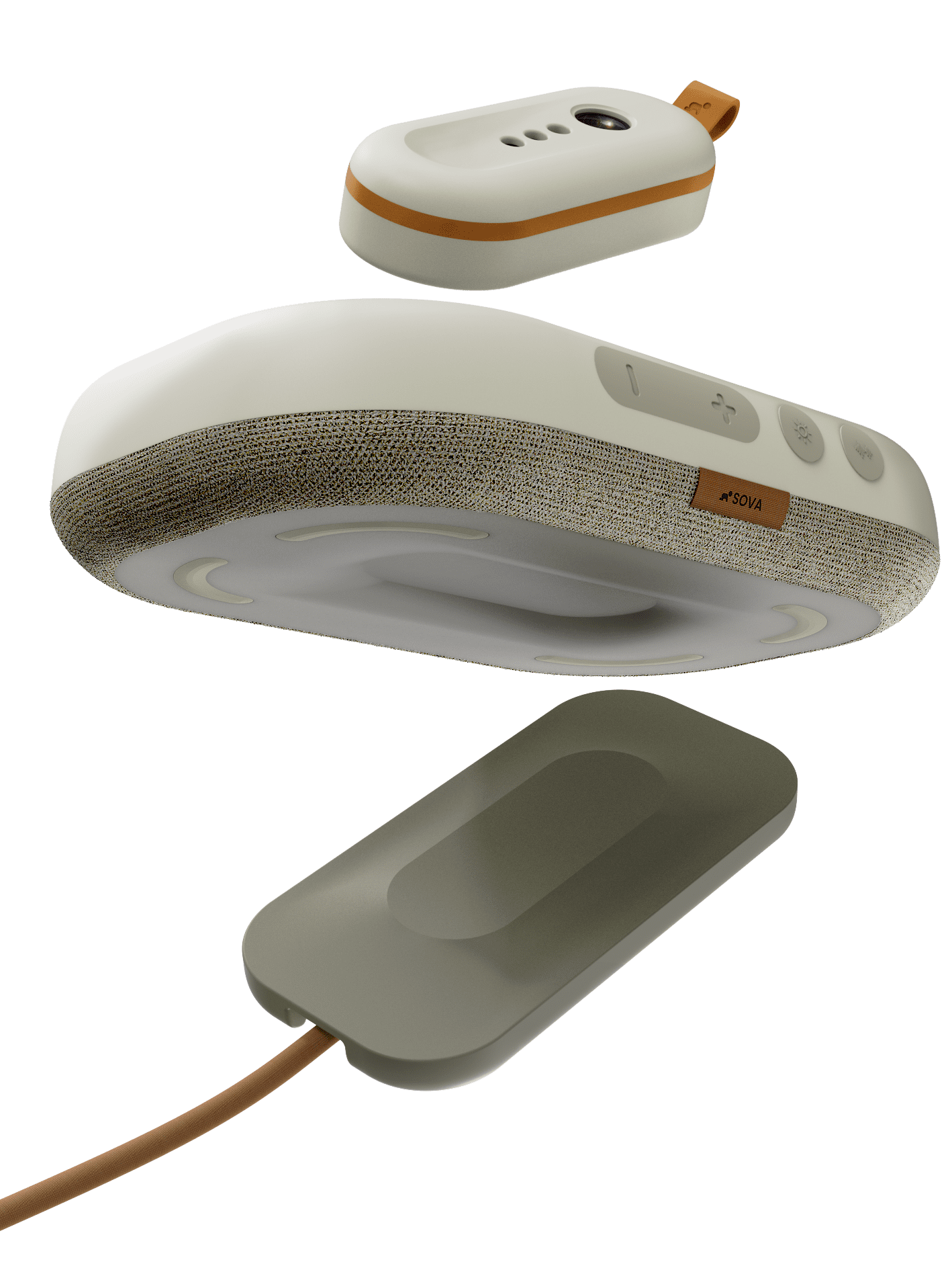
To fit within the home environment, materials such as fabric and polycarbonate were essential to encourage users to use the product more often. Child safety was also another consideration within the process and parts of the product that were in proximity of the child would have to be child-safe.
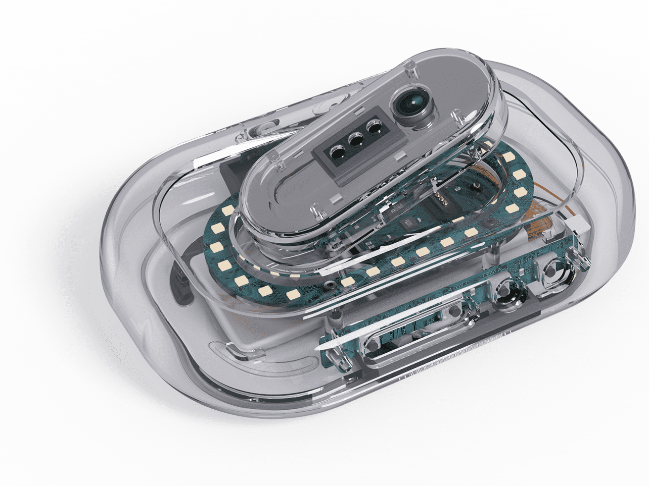
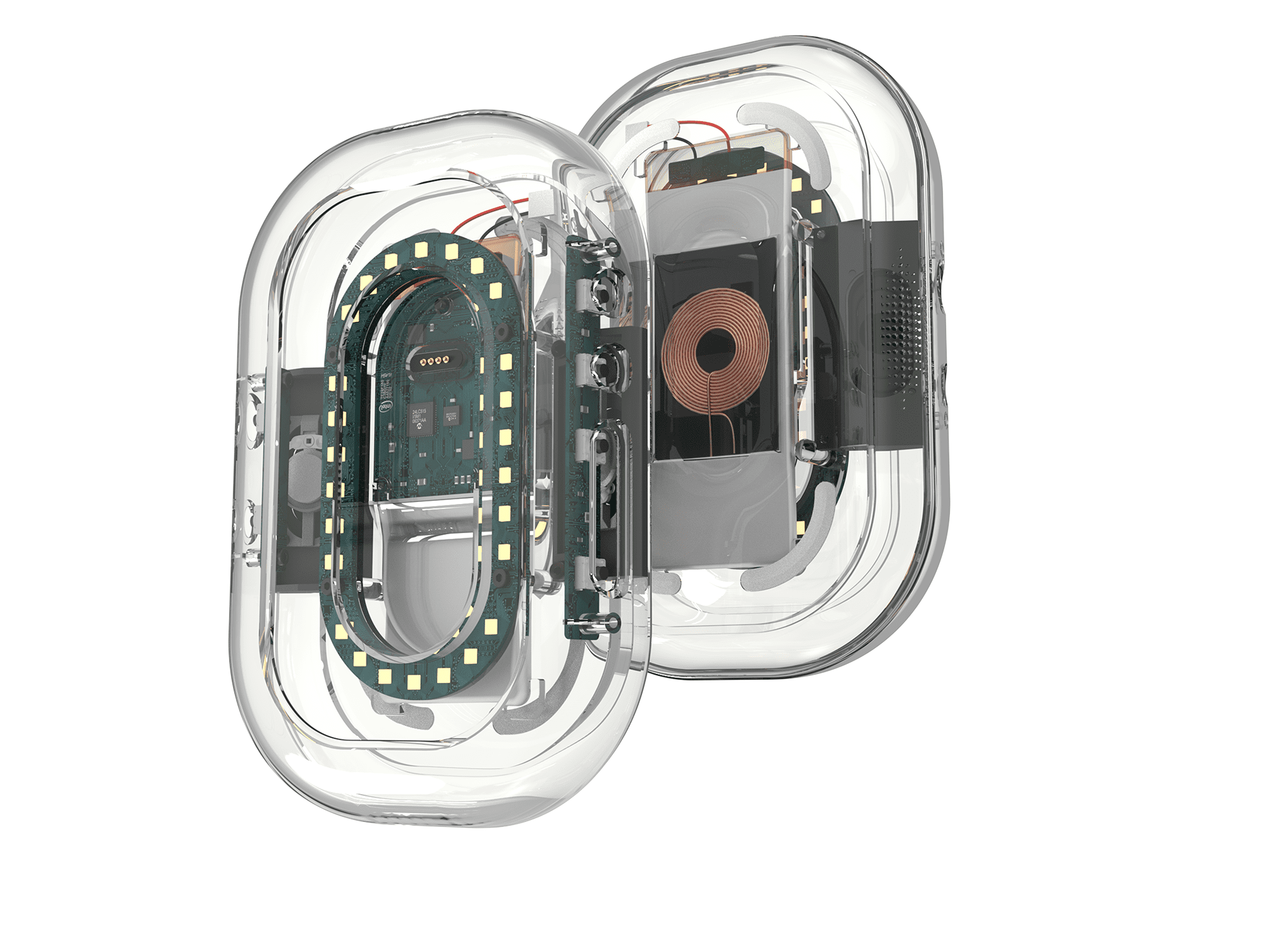
Development
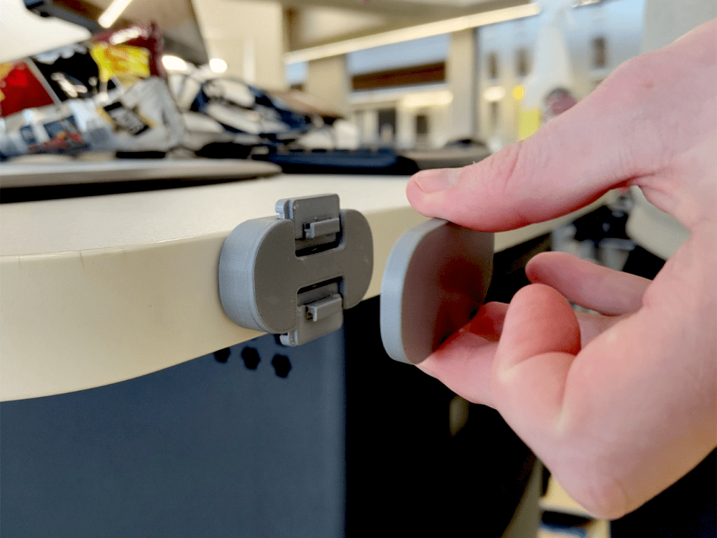
One of the main issues which I faced was the interaction of the sensor. Attachment of the sensor to the cot’s frame had to be sturdy and robust, but also quick and easy to attach and remove. This process took several weeks with 4-5 prototypes of each iteration.
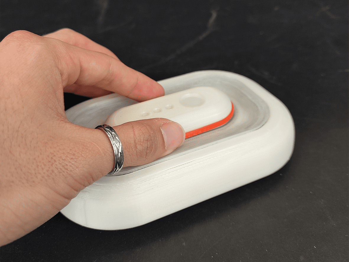
Another issue was the interaction between the sensor and the dock. Removing the sensor out of the dock needed to be visually clear for the user. The UX specialism was a large part of this development.
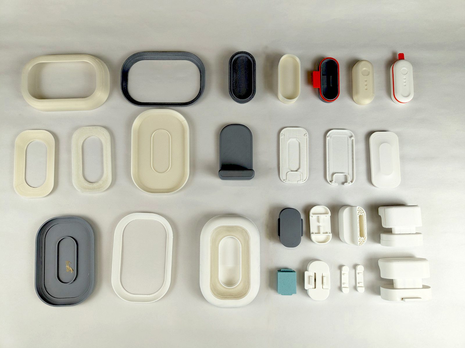
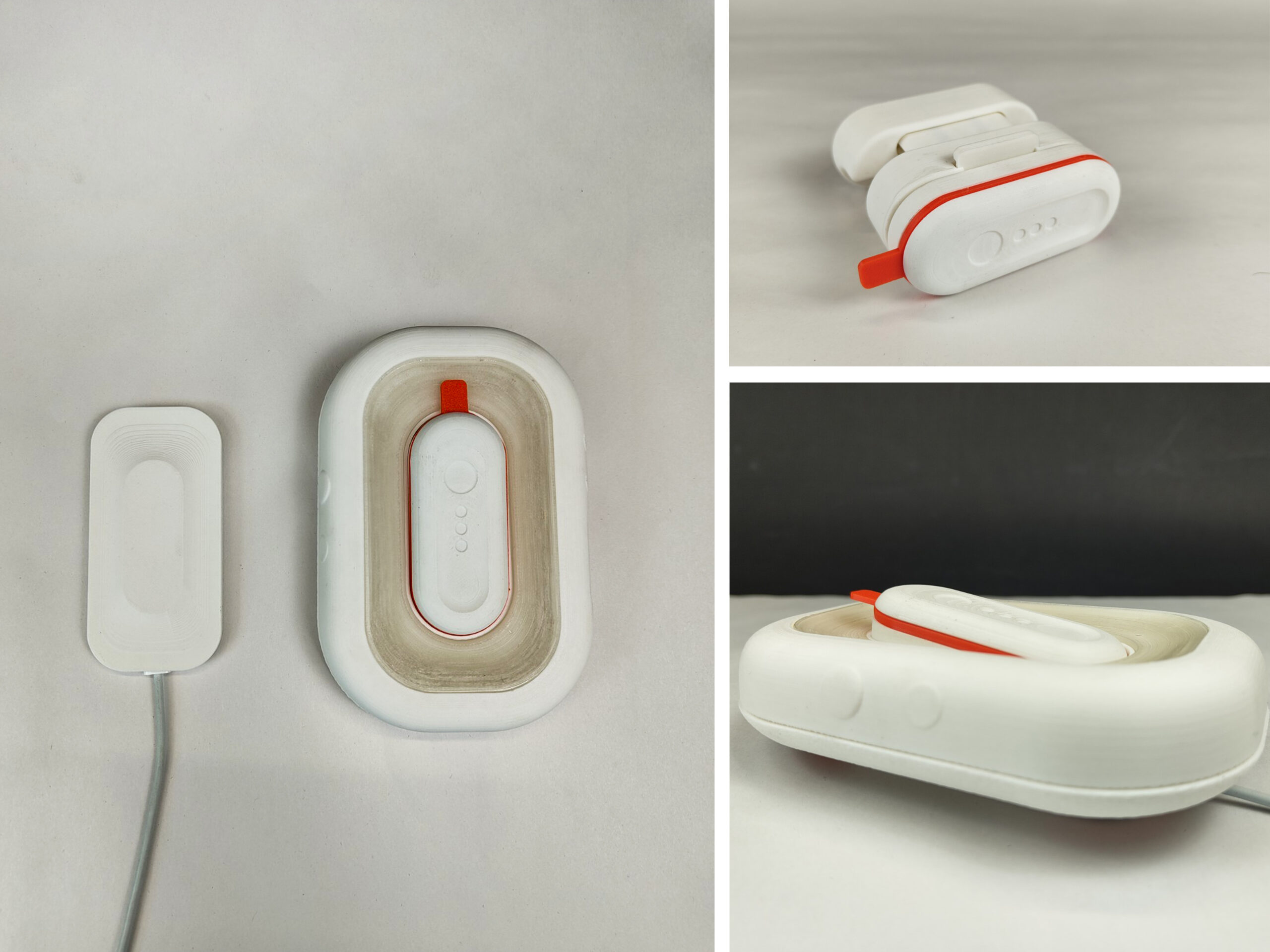
Throughout the 12 weeks of the prototyping phase, I engaged with over 20 prototypes. Together with stakeholder interviews and evaluations, I was able to develop a final 3D-printed model (shown below).
Live Project – PERA
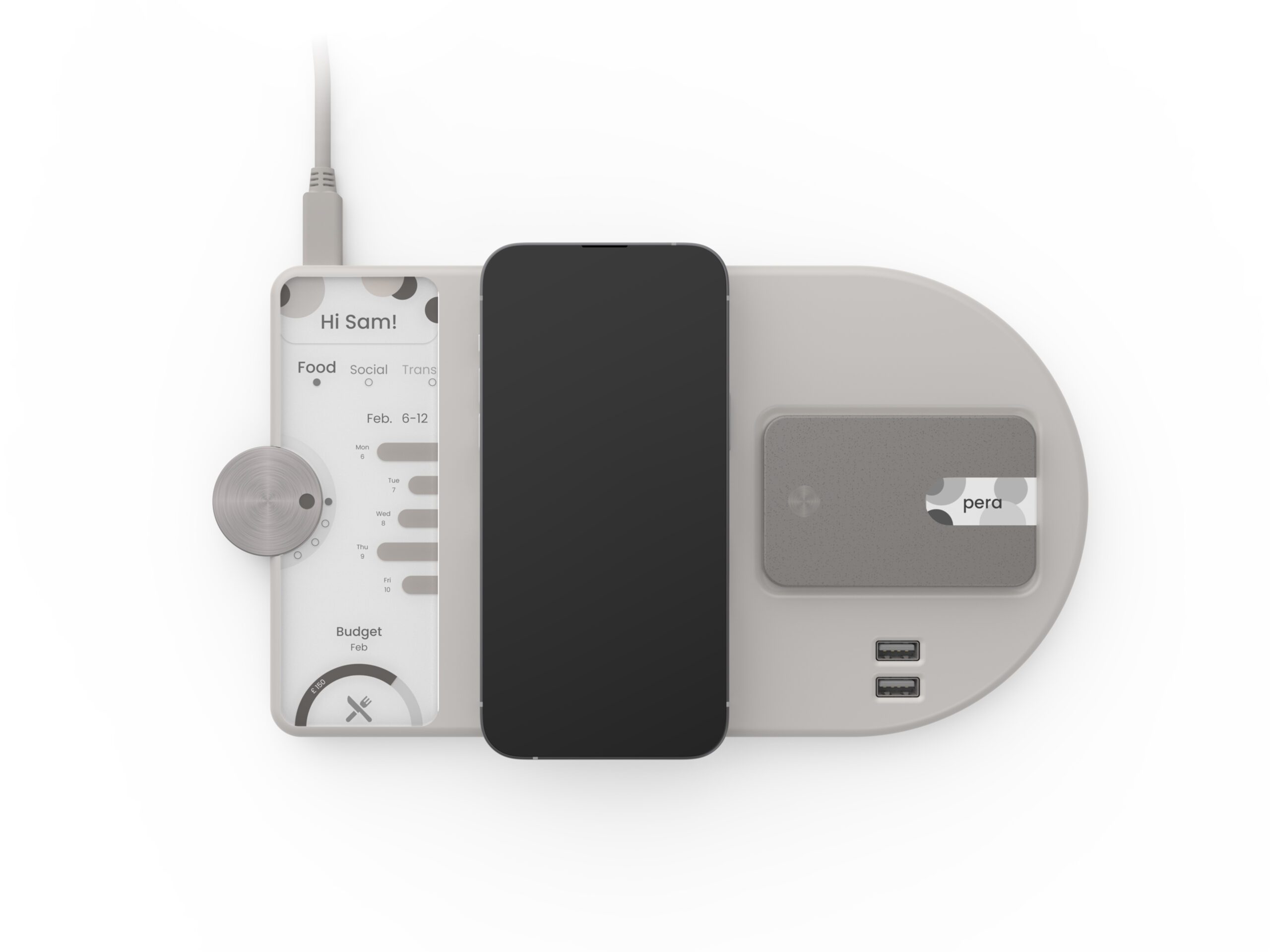
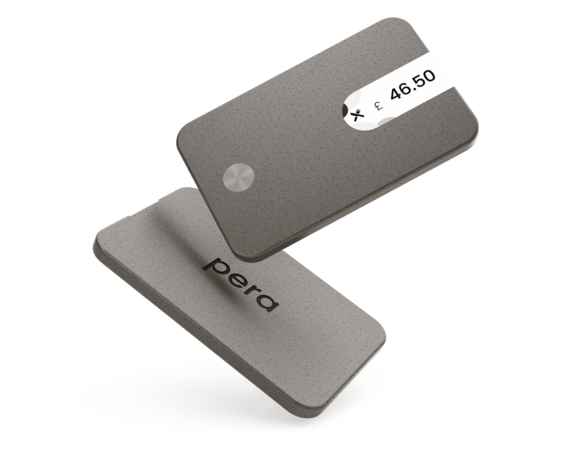
This 1-week design sprint was aiming at developing a tangible solution to improving the user’s financial health and transparency of the user. Aspects such as, the cost of living crisis and digital finance were large components of the project.
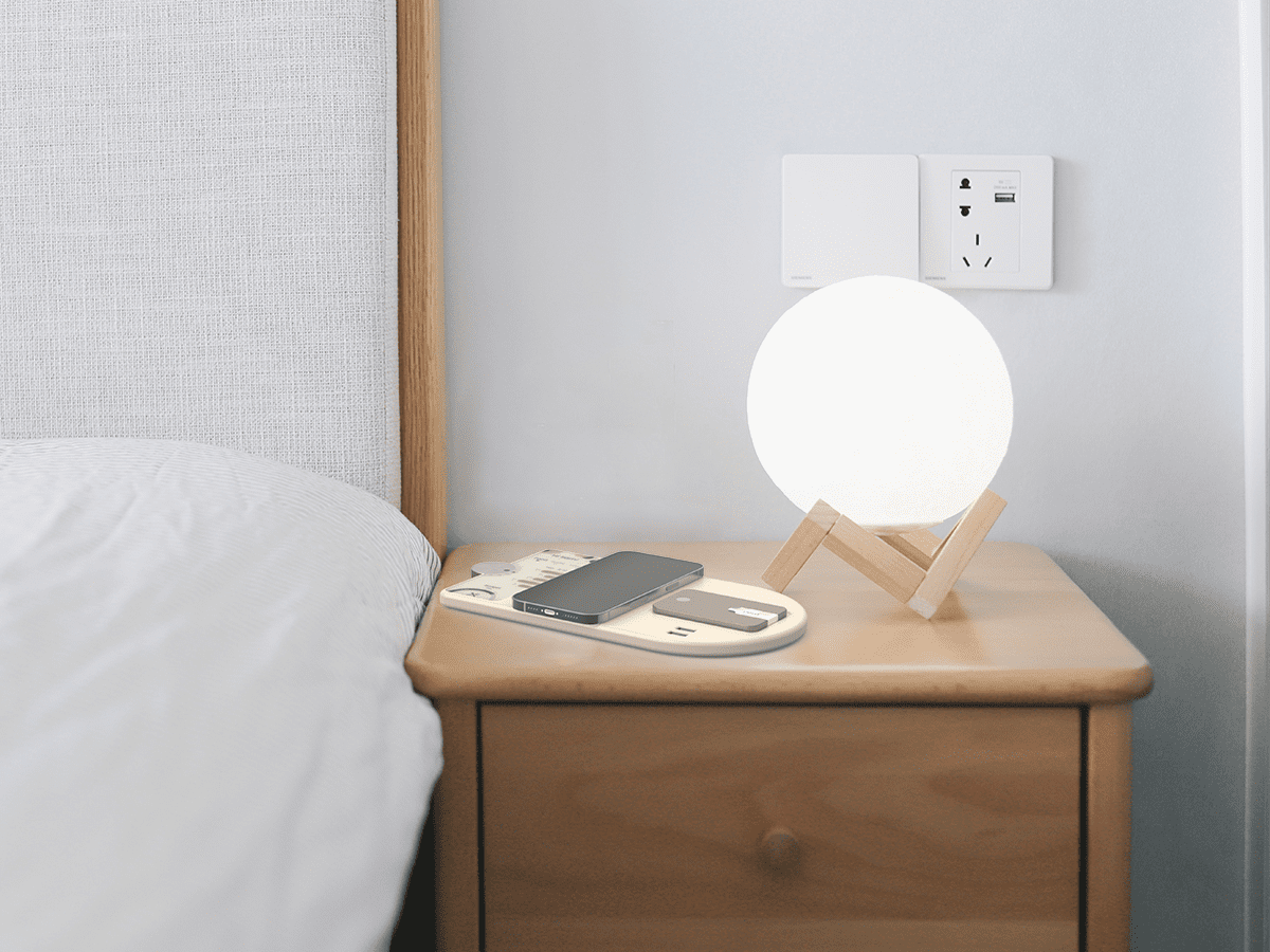
The concept proposed helped the user develop habits which increase financial literacy by giving nudges at the ‘point of purchase’. The end goal of the product was to facilitate a positive relationship with the user and their finances.
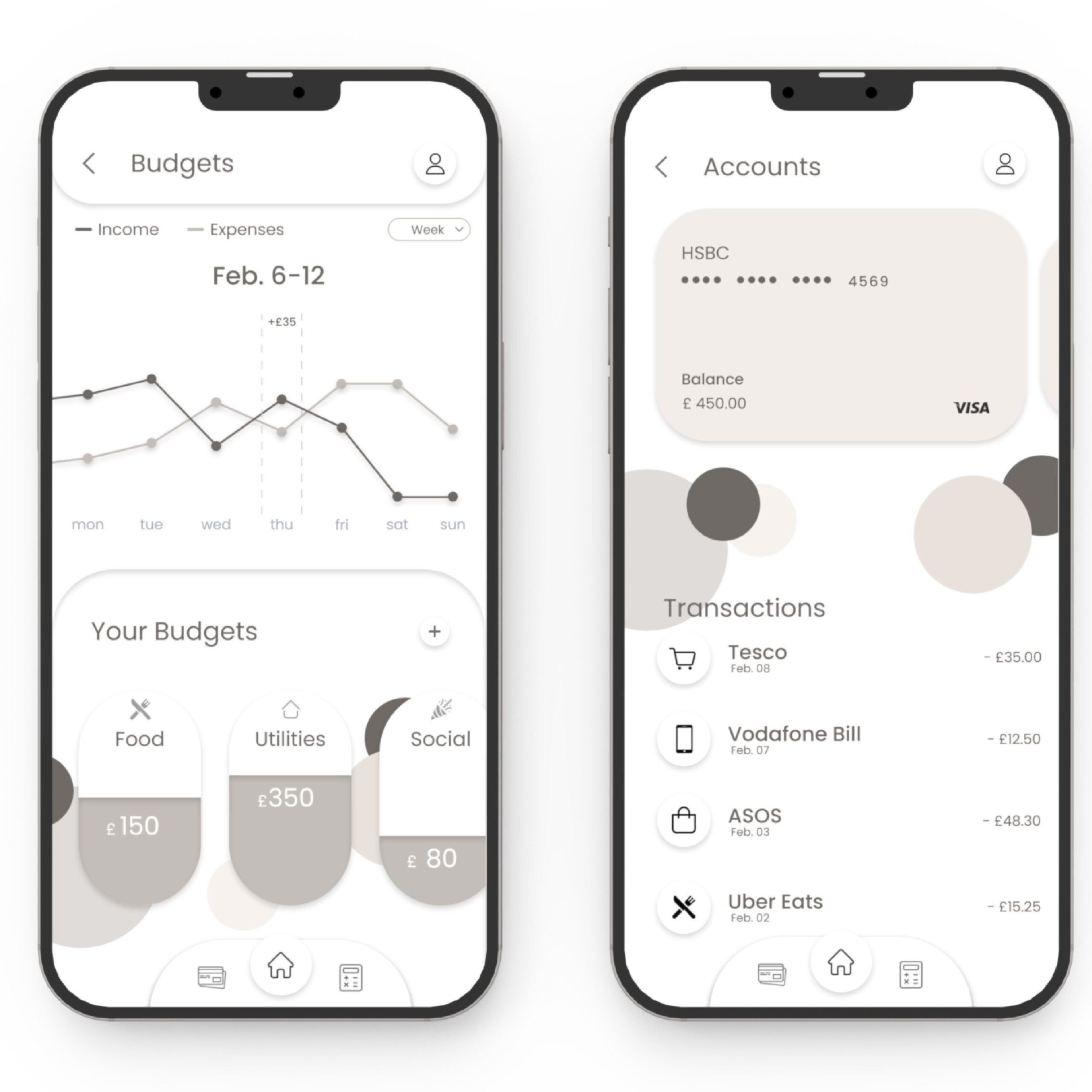
Pera acts as a barrier between objective and subjective influences and impulse purchases. Users would only be able to pay with their card by double checking their spending budget.
Awards
- Starpack Students Silver Award Sponsored by Graphic Packaging International
- Diploma of Professional Studies
Work Experience
My 10-month placement was based in Amsterdam at Studio Stallinga B.V. I worked as a Design Engineering Intern on several projects spanning from lighting interiors to graphic design. For a large part of the internship, the studio was designing their new studio and exhibition space; this required a more in-depth technical understanding of architectural engineering and CAD software.
Visionary Thinkers
Visionary Creators
Visionary Makers
