
Final Project
Visual Noise
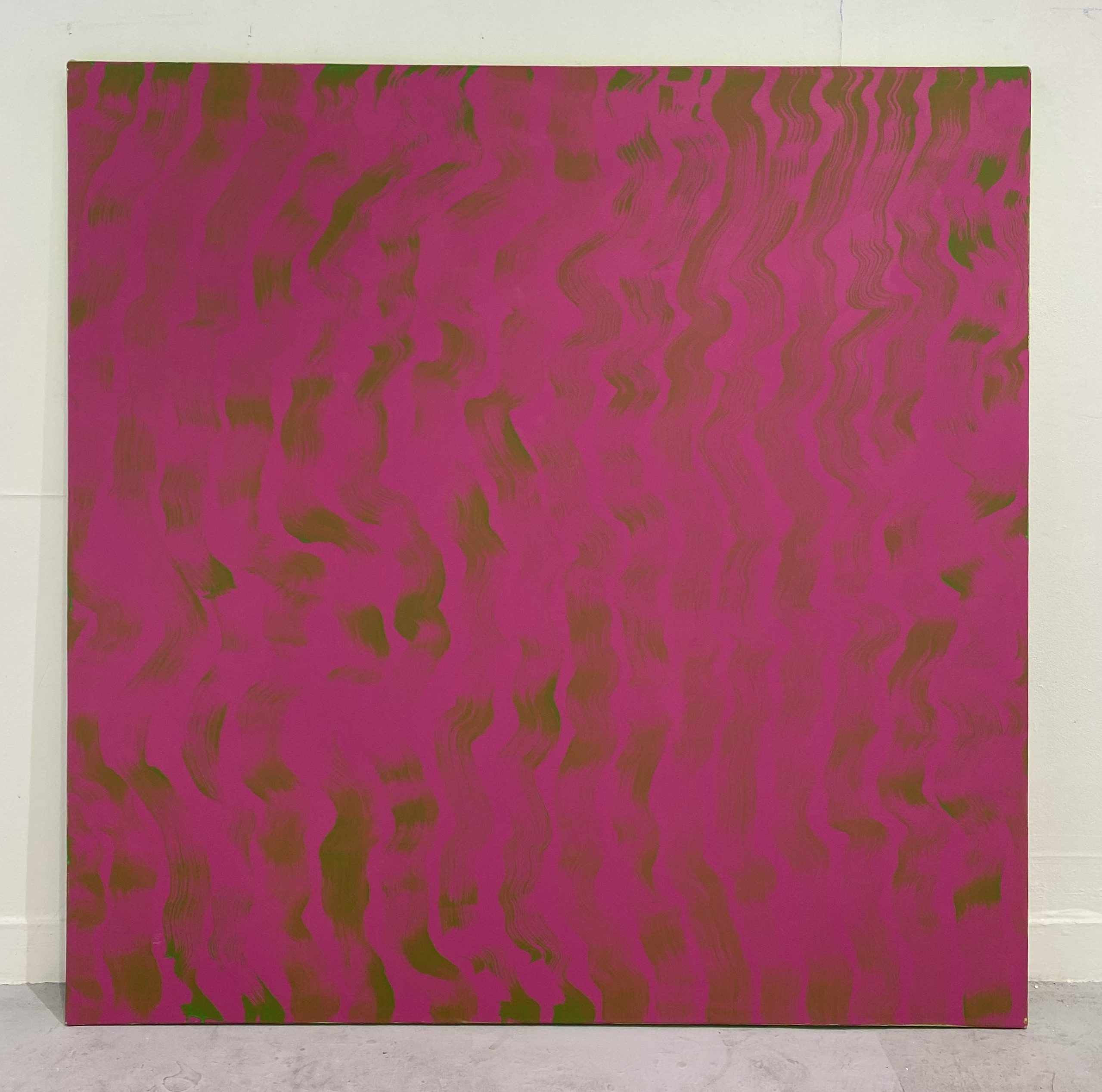
My work consists of large scale abstract paintings that explore the use of vivid colour. The way that the colours are used create optical distress for the viewers, this is achieved through simultaneous contrast. The choice of colours is the most complex part of my process, as the final effect relies on a chromatic intermingling of tones. There is an element of control in the choice of colours, but when they are placed on the canvas, they behave in a way that cannot be preconceived.
Right: Visual Noise Vol. 3, 2023, acrylic on canvas.
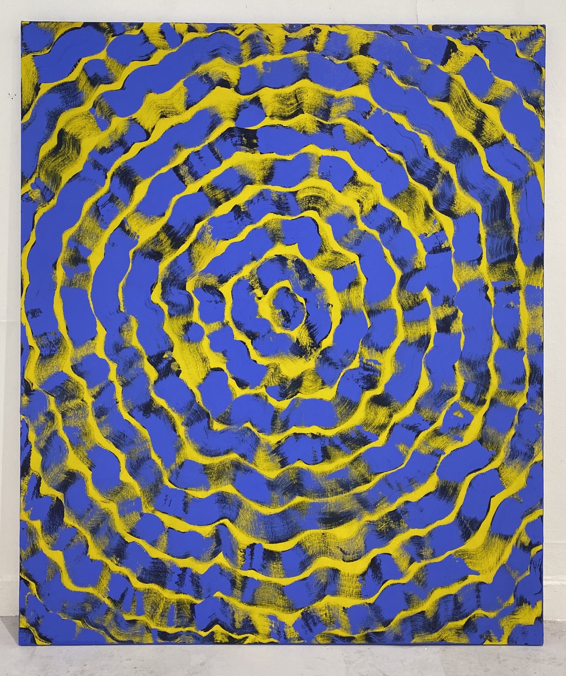
Visual Noise Vol. 1, 2023, acrylic on canvas.
My work explores simultaneous contrast; this term refers to the way in which colours affect each other. Through my paintings I have been exploring how one colour has the capability of altering the perception of the tone and hue of another colour.
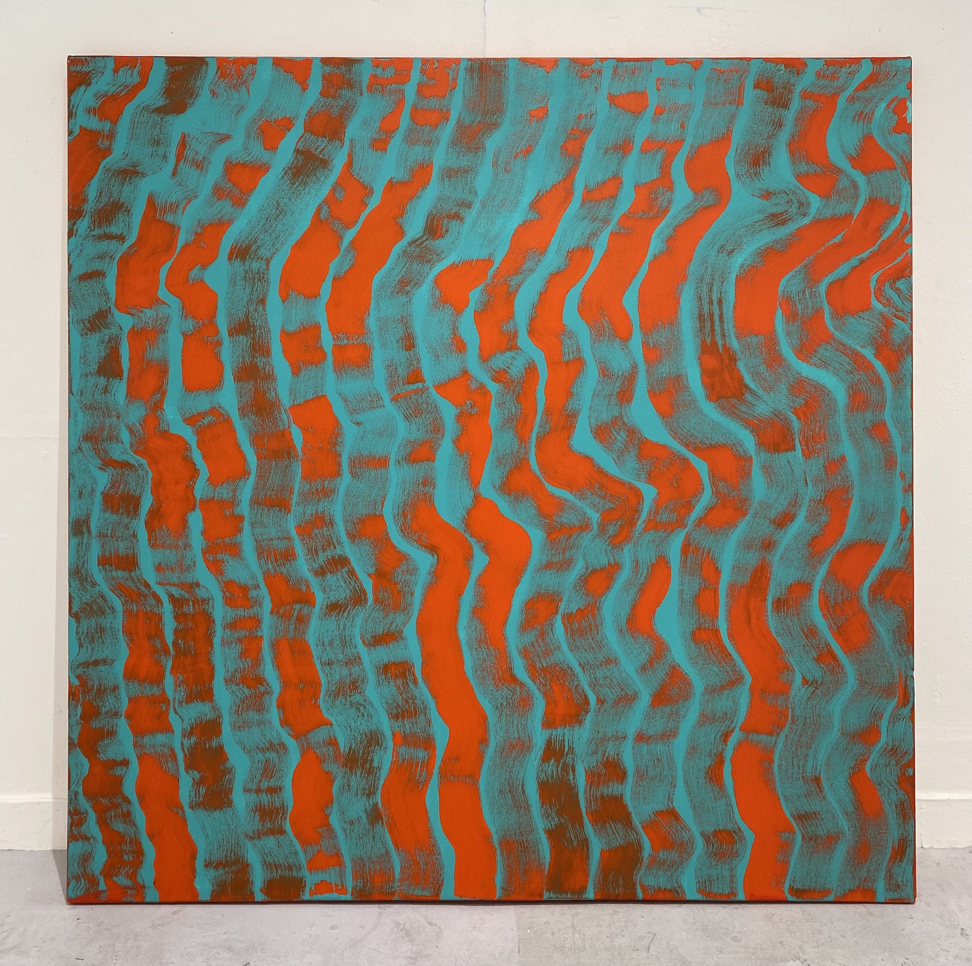
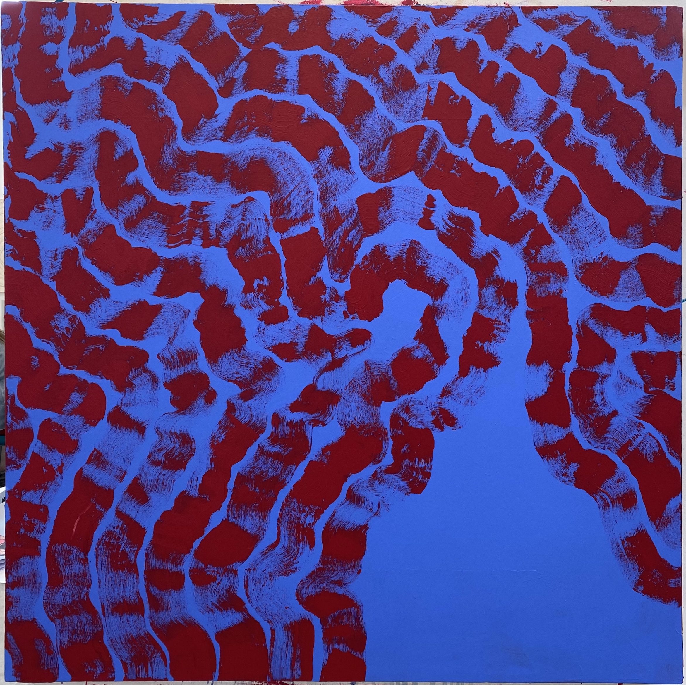
Visual Noise Vol. 2, 2023, acrylic on canvas.
As can be seen in Visual Noise Vol. 2, the aqua background appears as different tones dependent on whether it is next to a vivid area of colour or the more transparent areas of orange line work.
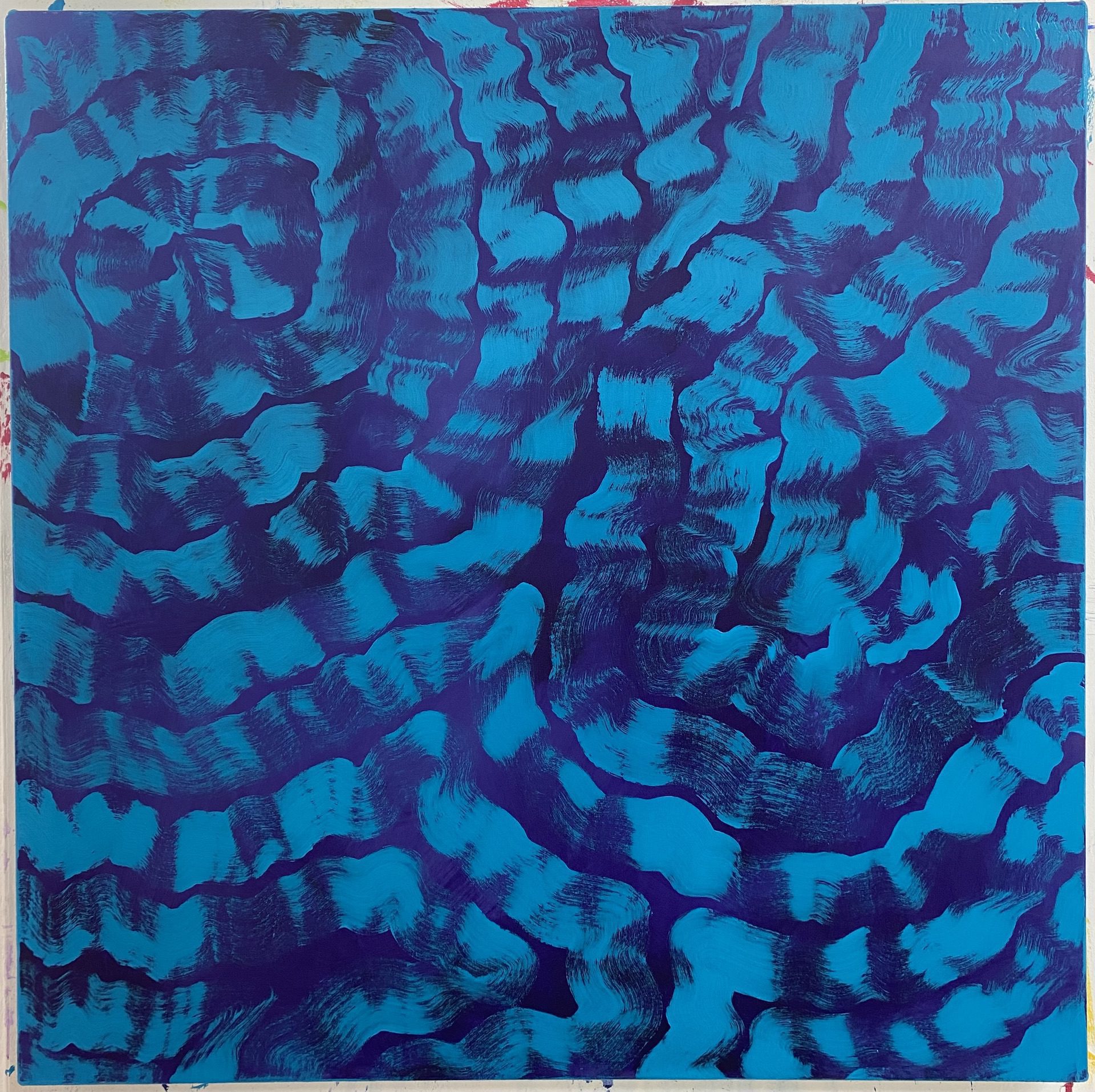
Visual Noise Vol. 8, 2023, acrylic on canvas.
Visual Noise Vol. 8, 2023, acrylic on canvas.
Journey to the Show
Towards the end of 2022, I began focusing on the use of colour within my work by looking at the interaction between colours. The basis behind the work I was creating started to rapidly develop during the research process of my dissertation; through the sources I was referencing my understanding of colour allowed me to put meaning behind the actions I was already taking.
Now in my practice, the colours chosen for a piece come from a lengthy period of decision making to ensure that the colours react in a way that creates optical distress for the viewer. The colours are purposefully vivid which, when matched with the overlayed line work, allows them to pulsate and confuse the eye.
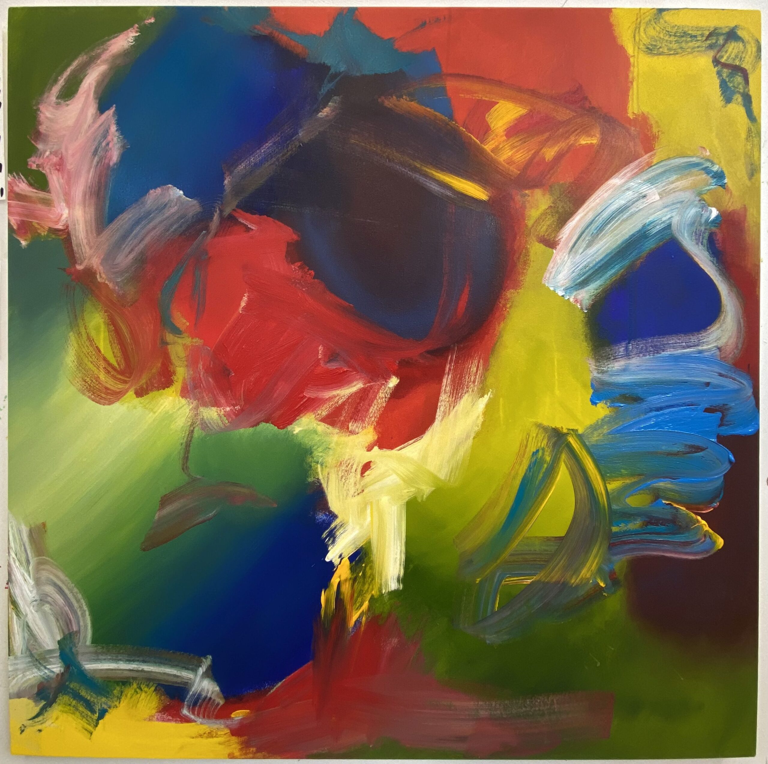
The Primaries, 2022, acrylic paint on canvas, 120 x 120cm
As a starting point in my exploration, The Primaries was created to explore how the primary (red, yellow and blue) and secondary (orange, green and purple) colours interact when placed together on a large scale. This painting also helped me gain further understanding of the cool and warm tonal values that colours hold, allowing for clear view of where they fit and where they don’t.
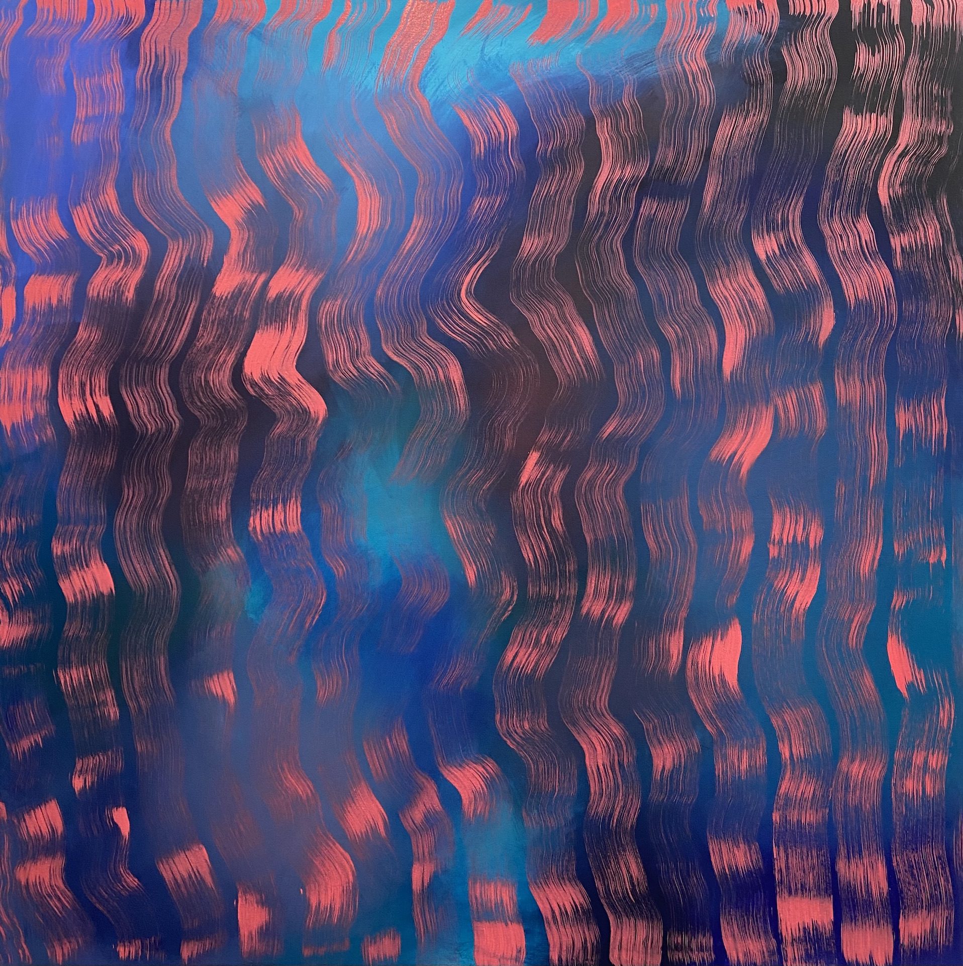
Chimera, 2022, ink and acrylic paint on canvas, 125.3 x 125.3cm
Chimera is a clear display of cool and warm shades interacting with one another in a way that benefits both sides. When the pink lines travel over areas of electric blue, the shades enhance each other to create a more vivid appearance. Whereas when the pink lines lay over the darker areas, only the lines colour is exaggerated visually.
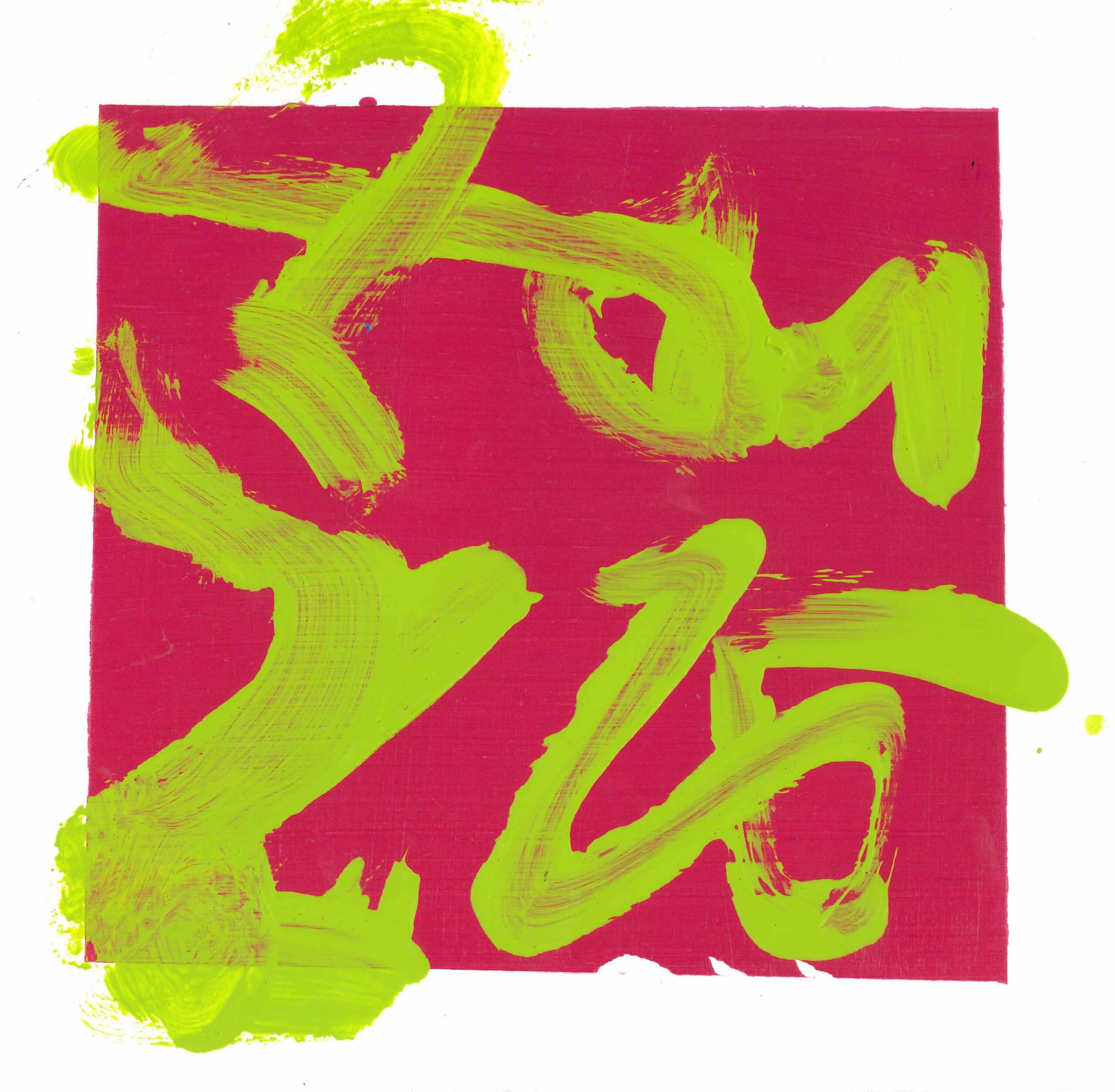
Procreate was a tool that I used to create quick digital mock-ups of potential colour combinations. Although it is difficult to create opaque acrylic colours that remain as vivid as those present in the digital versions, it gave a general idea of the optical noise that would be encountered with the physical outcome.
These outcomes are a really clear example of the distressing affect that the colour combinations have on the eyes. The images appear to be moving and are difficult to focus on when viewing different sections of the image.
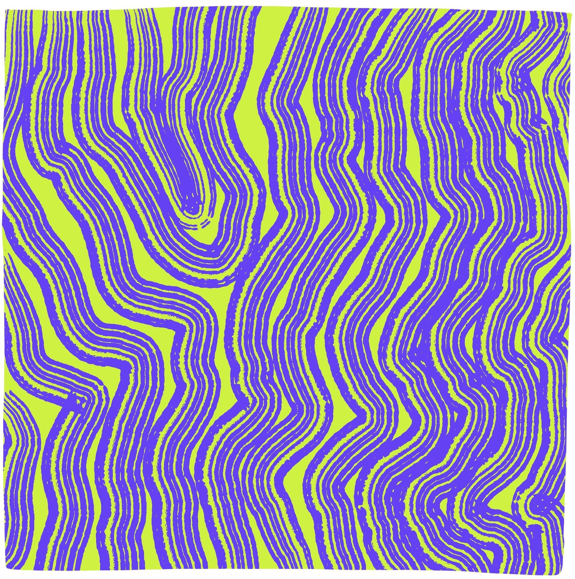
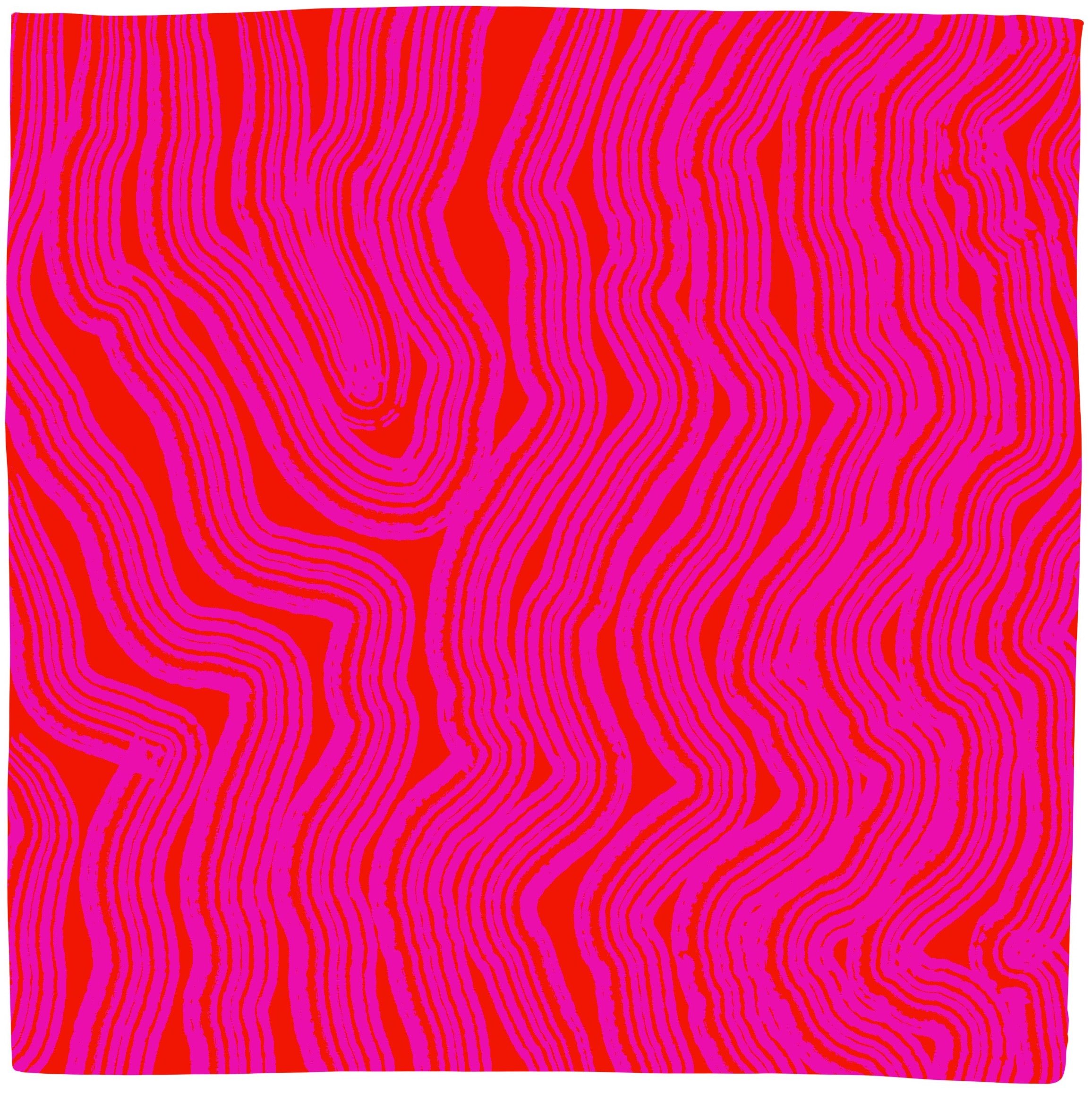
Pink on Red, 2023, digital plan.
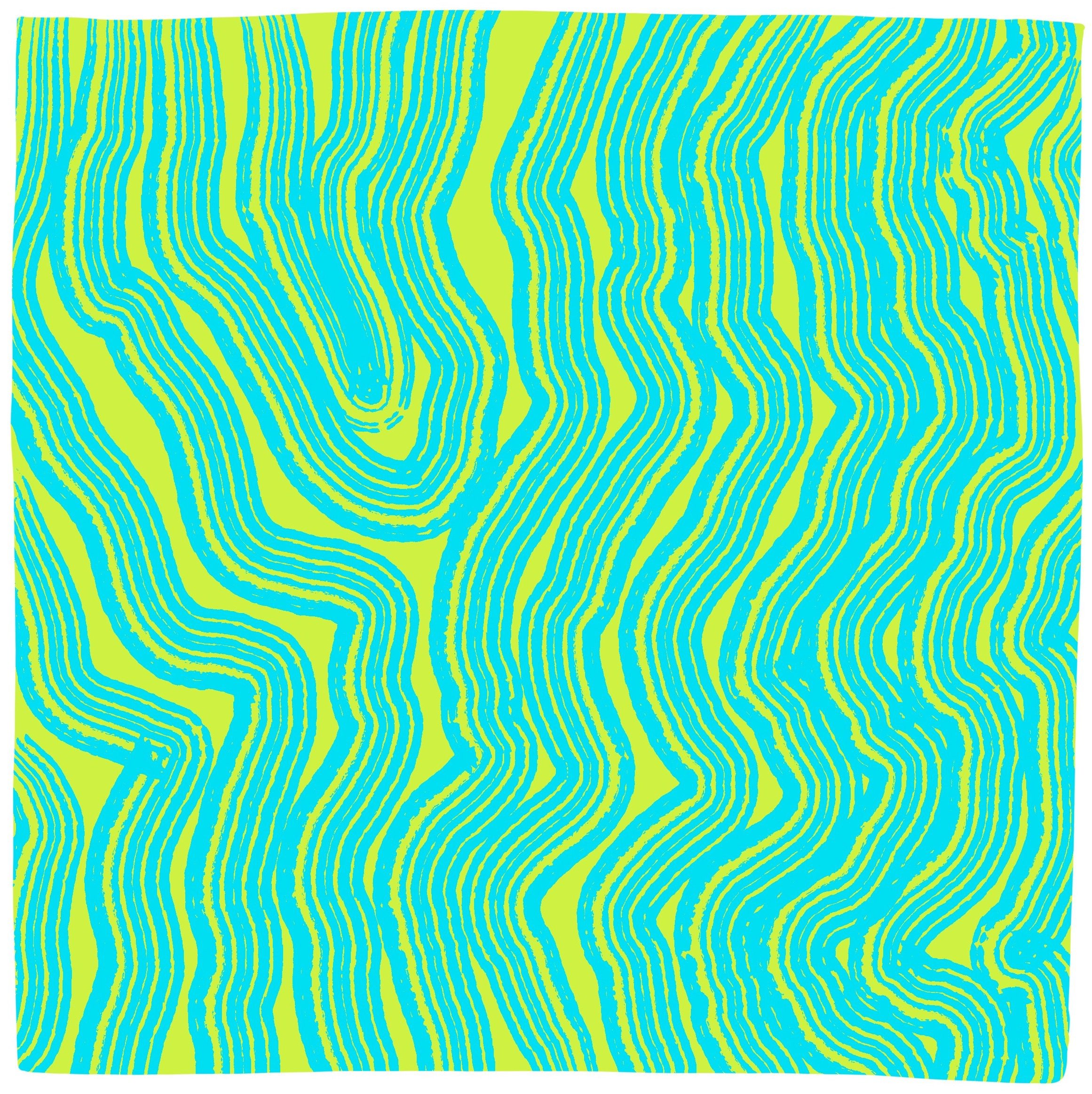
Aqua on Chartreuse, 2023, digital plan.
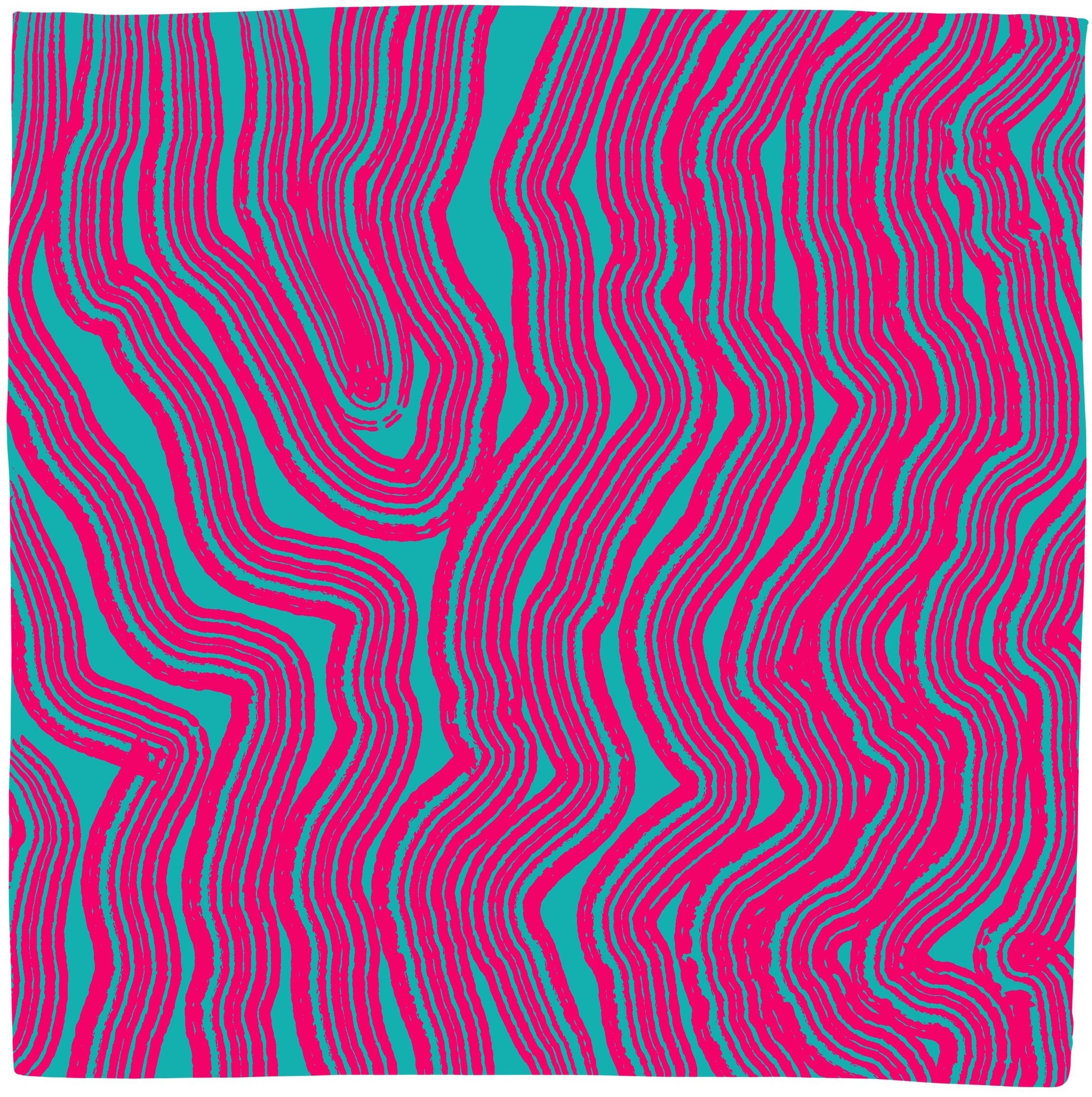
Pink on Turquoise, 2023, digital plan.
Previous Practice
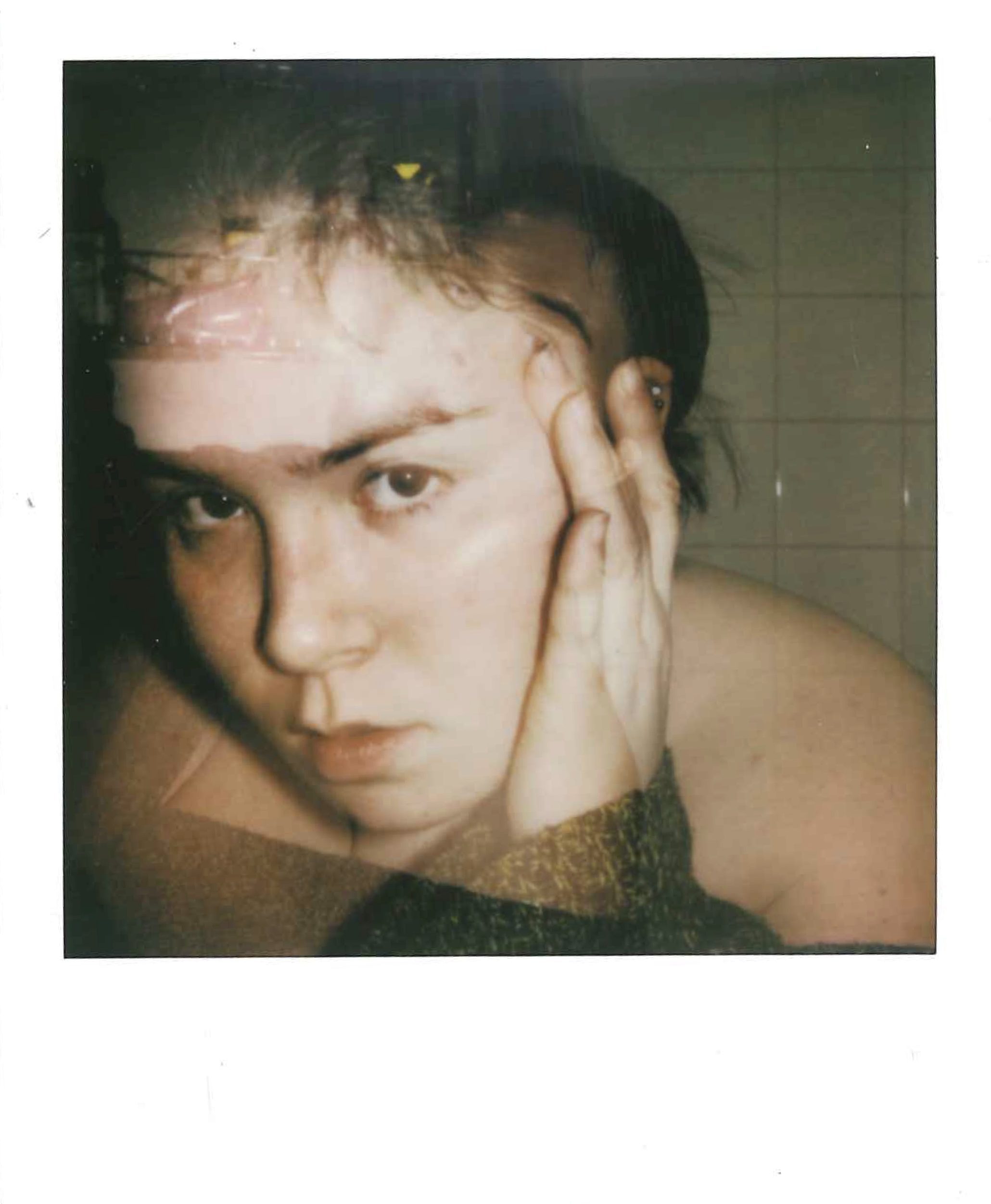
Over the years of completing the Fine Art course at Loughborough, my working practice has been through many iterations. In previous years I have delved into other methods of creation, in which I discovered a love for film photography.
The following selection of images is to showcase a small number of my successful experimental outcomes, which includes the use of polaroids, 35mm film, and collage.
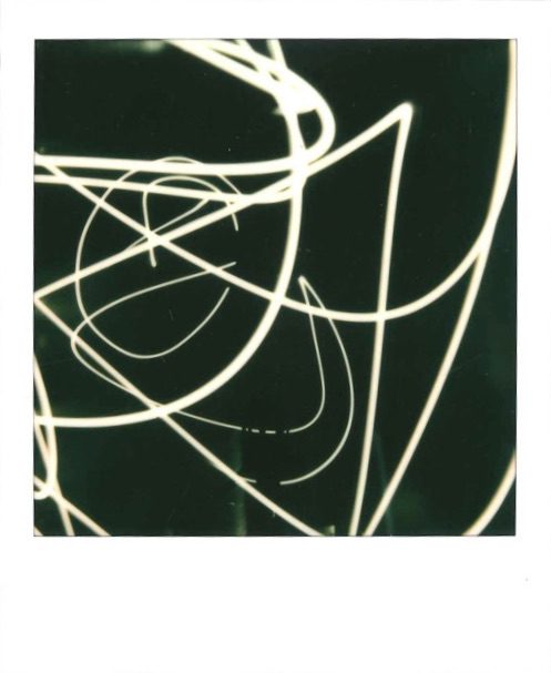
Light Route 1, 2021, polaroid.
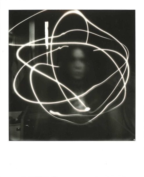
Light Route 2, 2021, polaroid.
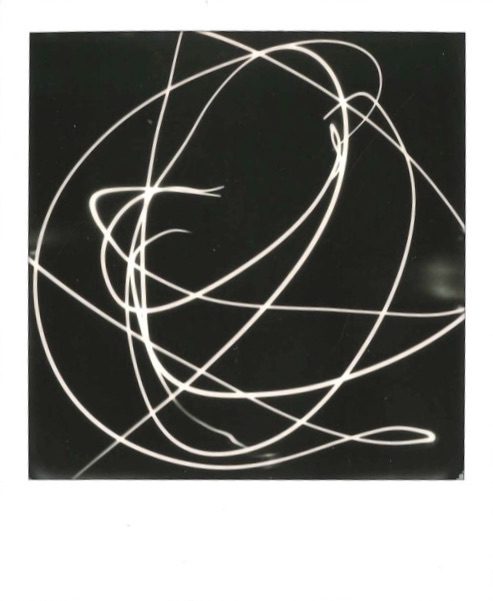
Light Route 3, 2021, polaroid.
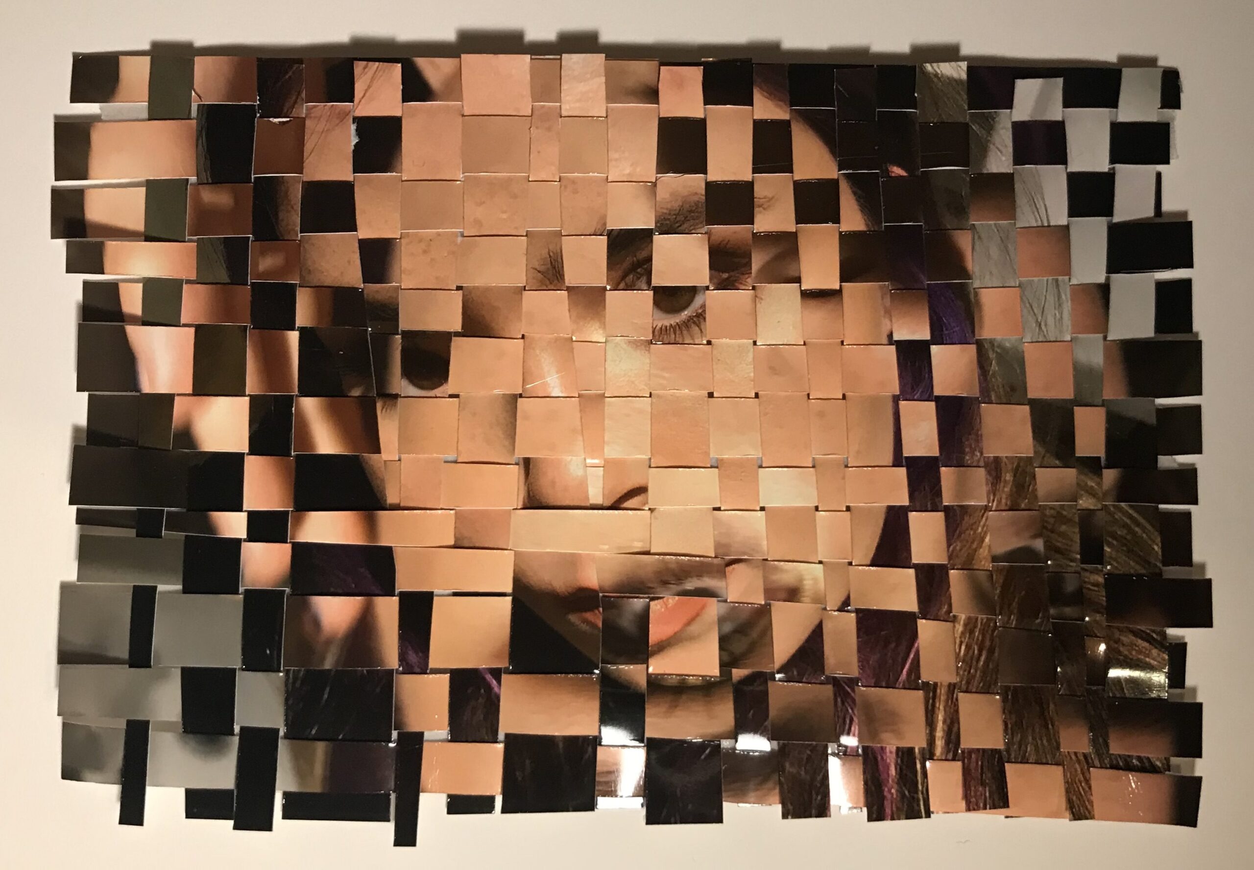
Intertwined, 2022, weaved images.
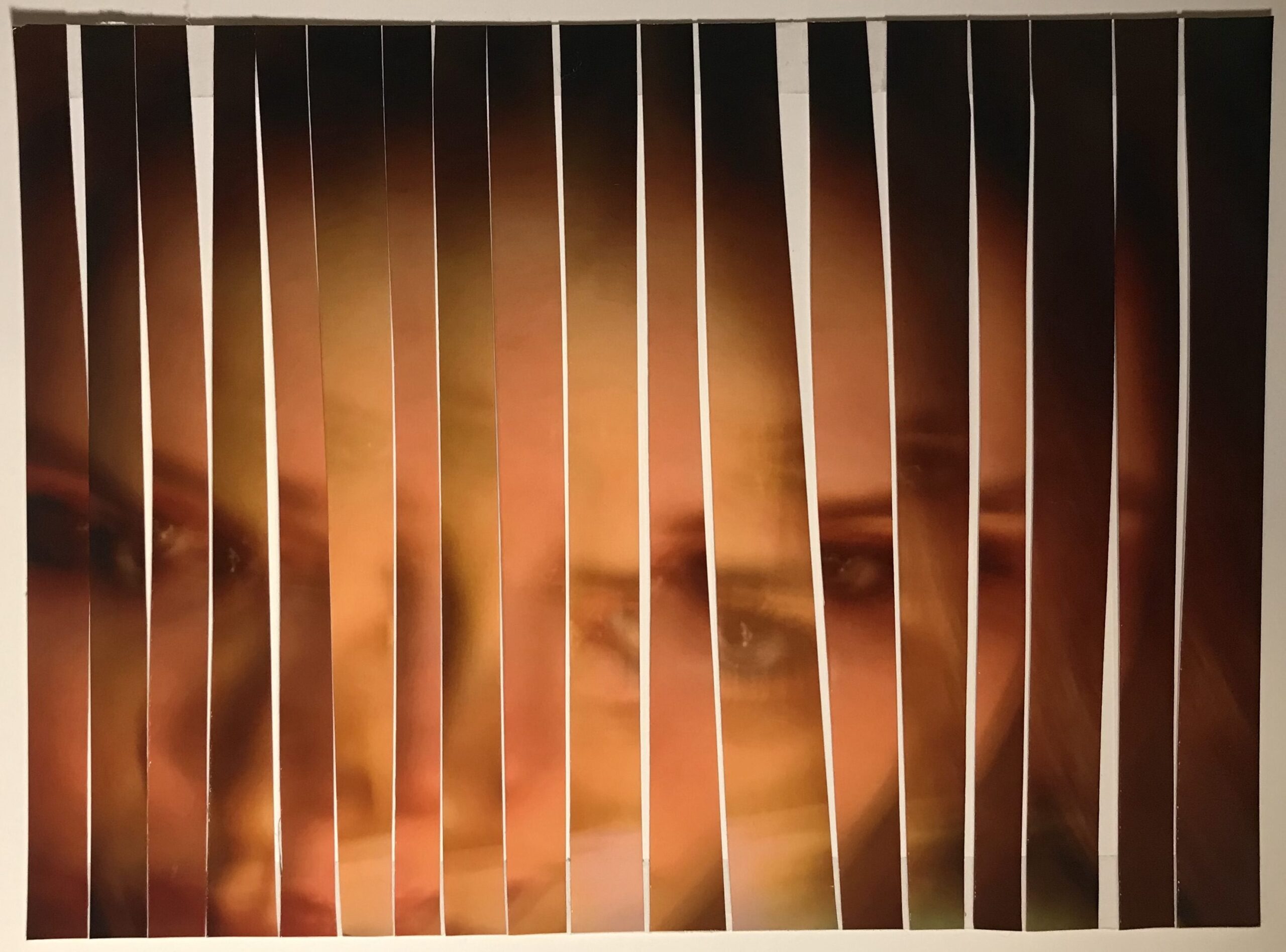
Spliced, 2022, sliced images.
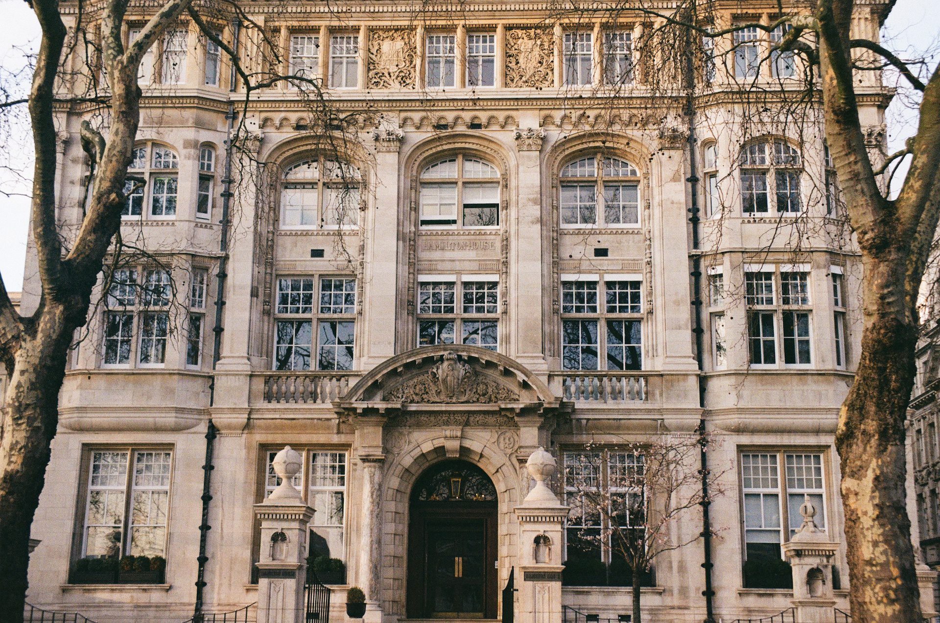
Untitled, 2022, 35mm Kodak colour film.
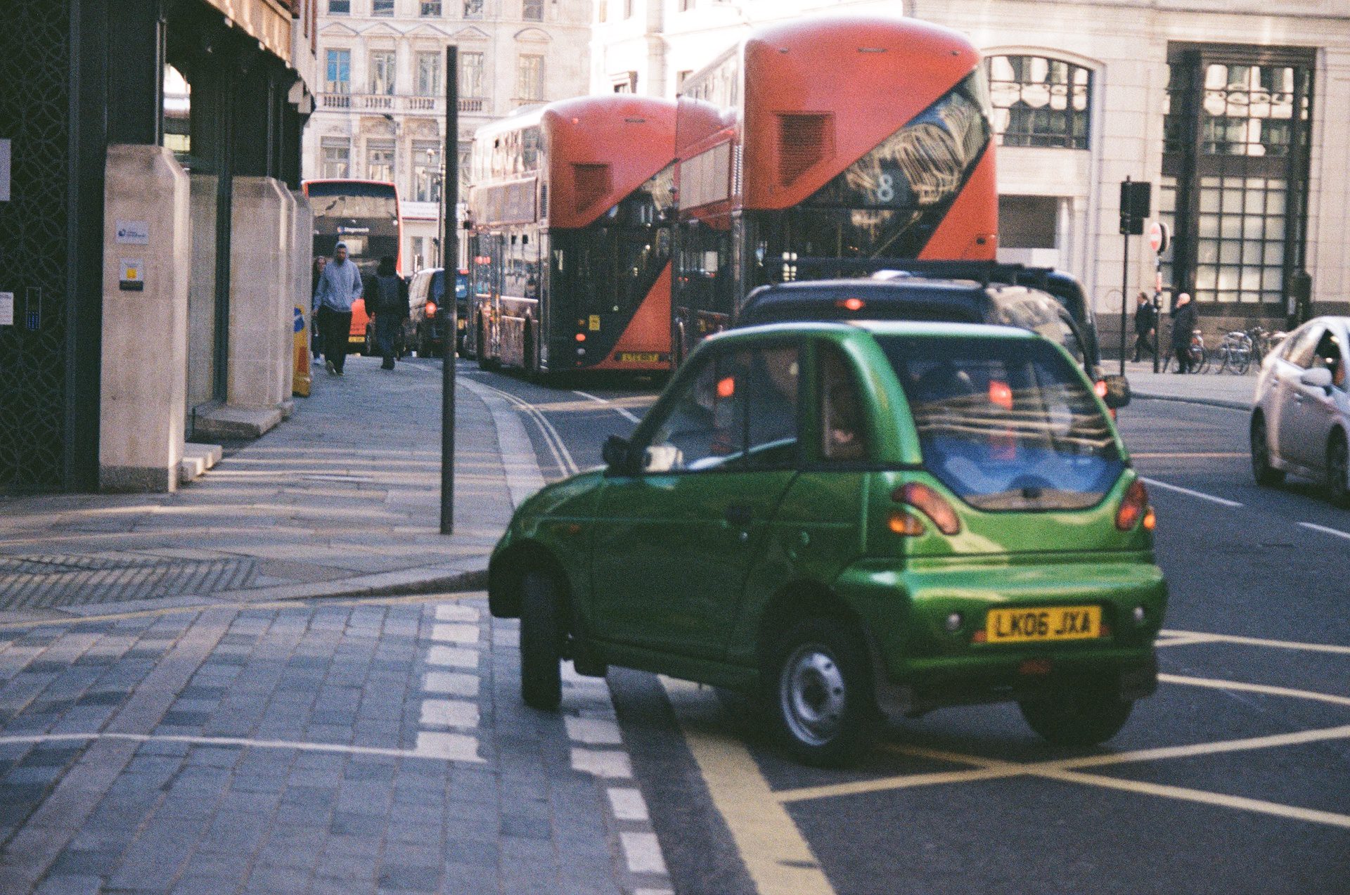
Untitled, 2022, 35mm Kodak colour film.
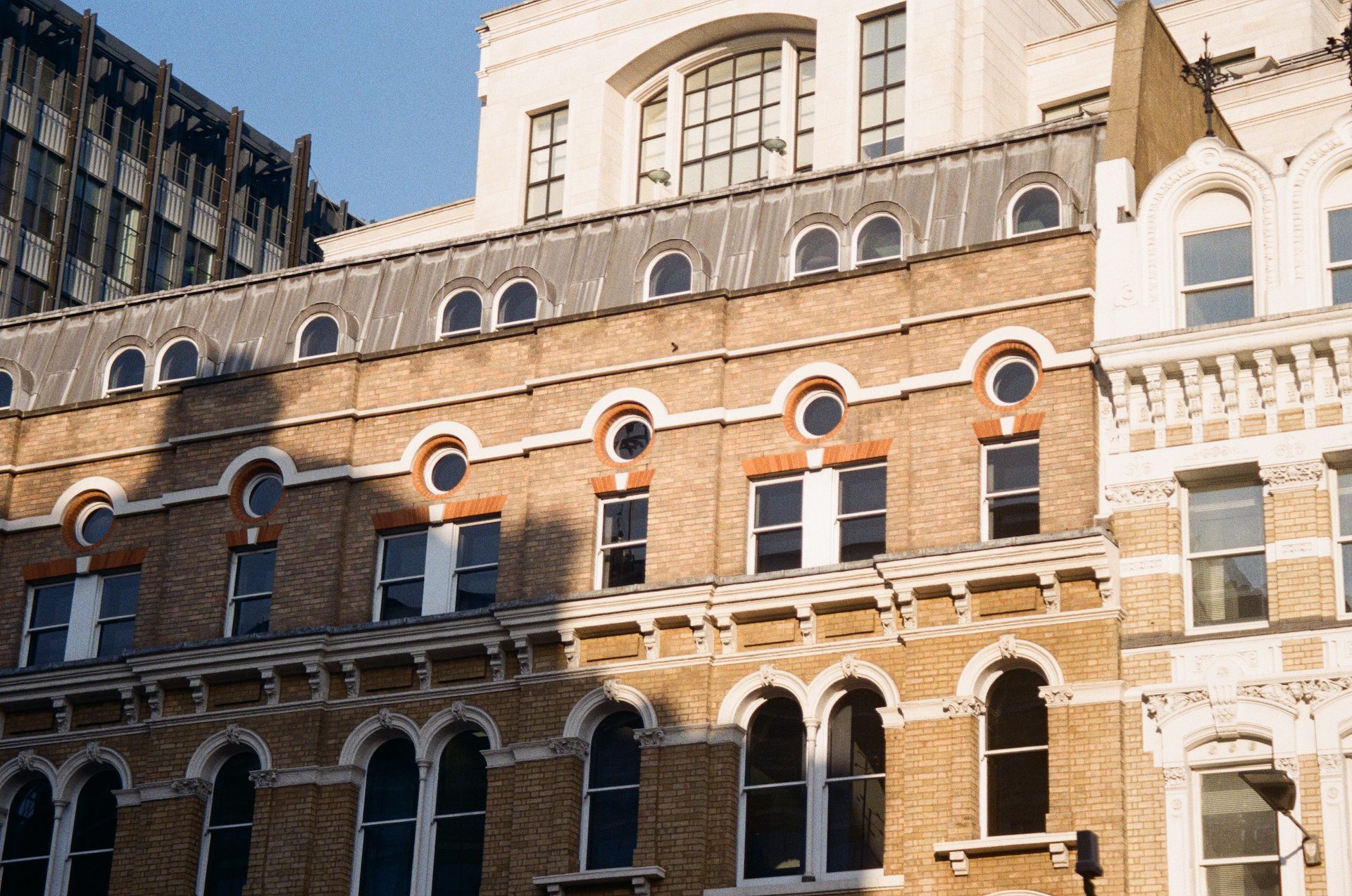
Untitled, 2022, 35mm Kodak colour film.
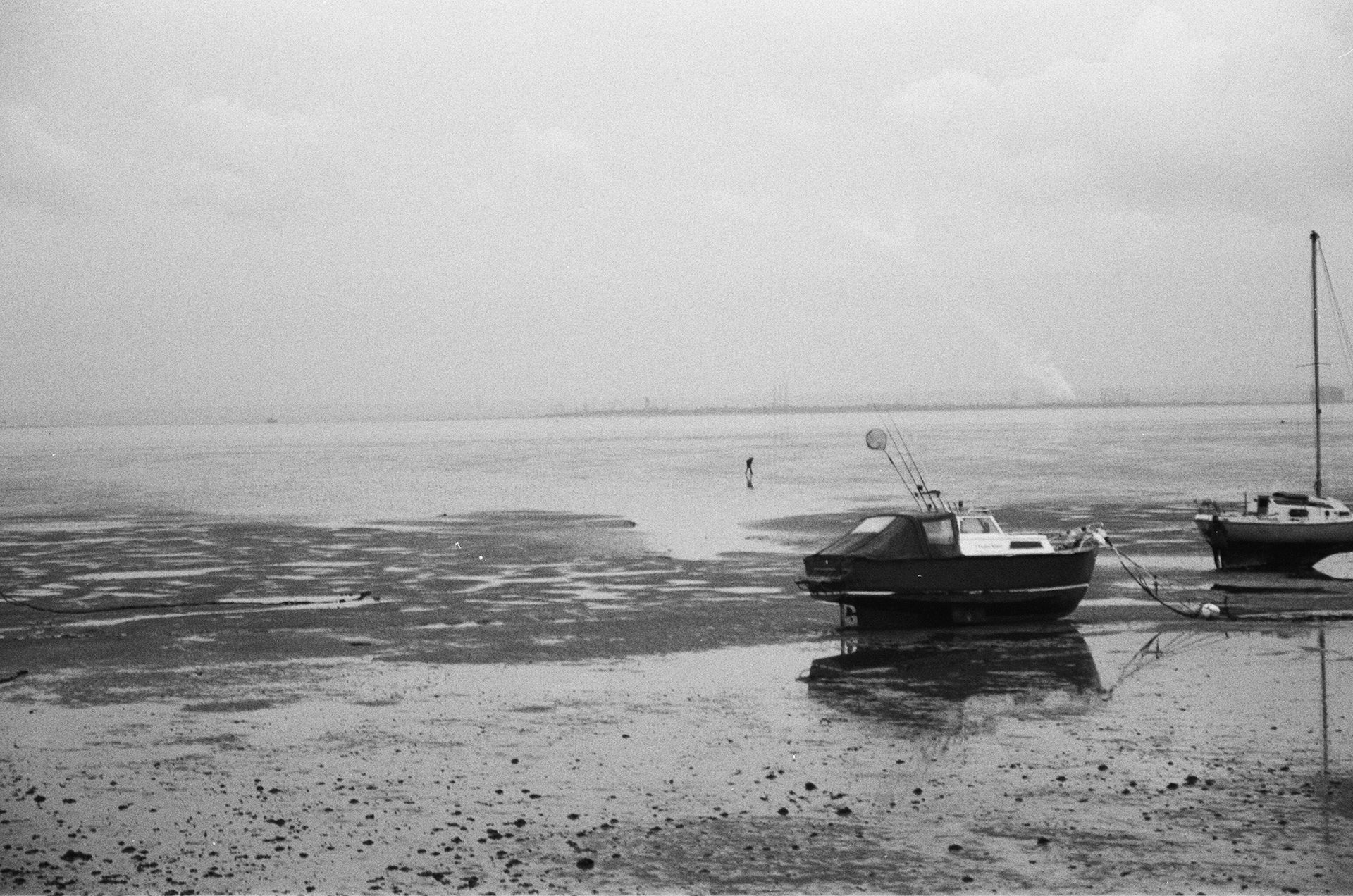
In the Midst, 2021, Ilford FP4 PLUS 35mm 125 Black & White Film.
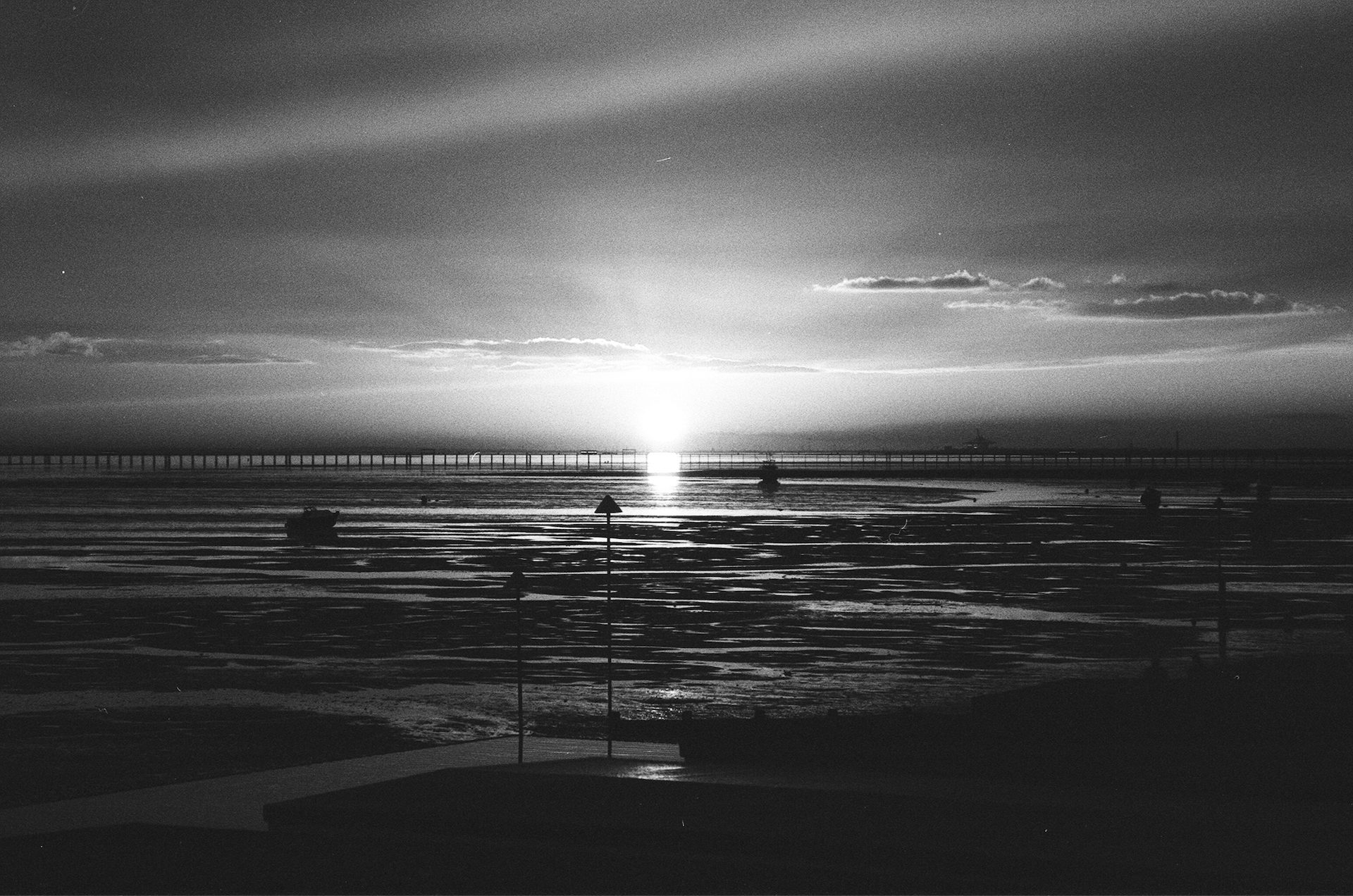
she sets, 2021, Ilford FP4 PLUS 35mm 125 Black & White Film.
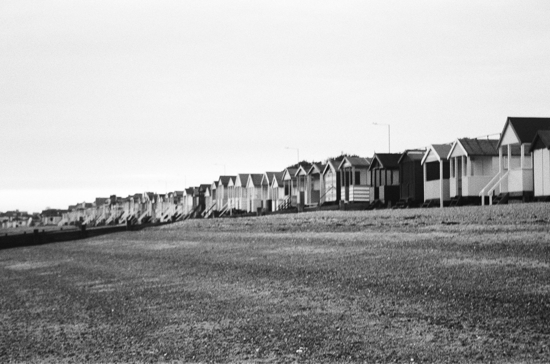
Cohesive, 2021, Ilford FP4 PLUS 35mm 125 Black & White Film.
Visionary Thinkers
Visionary Creators
Visionary Makers